Spotting top-notch supply and demand zones is a challenge, a whopper of a challenge, really.
Sure, you’ve got a few tricks up your sleeve – looking for a lengthy preceding move or checking if a zone lines up with other technical factors are your best bets. But, even with these, pinpointing strong zones is anything but a piece of cake.
But hey, your luck’s about to change…
I’ve stumbled upon a tool that makes the hunt for powerful zones so much easier.
Enter: The Cot Graph!
Drawing on data from the Commitment of Traders report, the Cot graph reveals when the banks have ramped up or scaled down their number of open trades in the market (both long and short).
In a nutshell: we can see when the banks are entering with large trades.
Pairing that with what I explain in my S & D course, we can harness the data to figure out where the most potent supply and demand zones have formed.
This makes it a breeze to spot and trade strong zones.
Sounds like a plan?
Finding powerful zones using the graph is straightforward enough, but there are a few steps to follow to make sure you’re landing on the right zones and steering clear of the duds – more on this in a bit.
First, let’s unravel why the Cot graph is great for spotting powerful zones.
The Cot Graph – Why It’s So Useful For Finding Good Zones
Powerful supply and demand zones don’t grow on trees, and hunting down the best zones usually calls for a deep knowledge, built over many years of trading.
Or, well, it used to…
Step in: The Cot Report.
Dished out every Friday, the Commitment of Traders report (Cot for short) reveals the positions of traders in the forex, commodities, and futures markets – and yup, that includes the big-shot banks.
The report lets you in on whether there’s been a surge or slump in net-longs (buy trades) or net shorts (sell trades) entering into the market.
This means…
You can peek into whether the banks are entering or removing positions.
Unbelievable, isn’t it!?
By understanding how the banks operate and applying a little math, you can use this information to pinpoint where the strongest supply and demand zones are hiding.
Take the zone below, for instance…
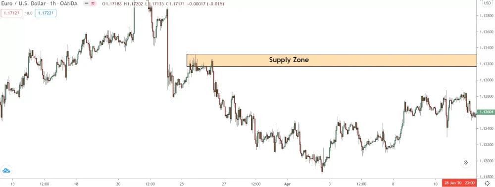
The zone above stands a super high chance of triggering a reversal.
How can I tell?
Because during the week it formed, there was a massive surge in the number of sell trades placed by the banks and other big institutions.
This becomes crystal clear when we pull up the Cot Graph…
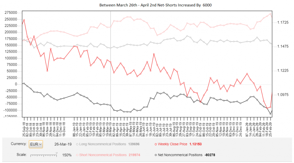
By comparing the week the zone formed against the previous week, we can see between the 24th and 27th of March, the banks played 24,000 new sell trades – an enormous jump!
These new trades had to be entered somewhere, but where?
Well, given the banks can only sell when price is rising – since they need buyers to sell into – these trades must’ve been placed when price was rising during the week the zone formed. And when was the only time price really increased during that week?
That’s right – right before the supply zone formed!
So the zone is the most likely spot they entered these new trades.
And, lo and behold…
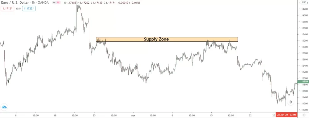
Price reversed upon returning, confirming the banks and other big players entered their positions here as shown by the graph..
See the beauty of using the Cot graph – it makes finding strong zones a piece of cake!
Now, let’s dive into how you can do this all by yourself…
How To Find Zones Using The COT Graph – My 3 Step Method
Finsing institutional zones with the order graph doesn’t require a PhD… I’m living proof of that!
But, you’ve got to follow the right steps in order to zero in on the strong zones and not the flimsy ones.
That’s where yours truly comes in!
To give you a leg up, I’ve created a straightforward three-step method for hunting down institutional zones using the COT graph. These three steps make it a breeze to extract data from the graph and put it to work in finding the right zones; no experience required.
Just open the tool, gather the data, and mark the institutional zone.
Piece of cake!
Here’s the game plan…
Step 1: Locate The Zone You Want To Check
First off, track down the zone you’re keen on vetting with the Cot Graph.
With this approach, we don’t “discover” fresh zones per se, but instead cross-check existing zones against the graph to see which formed from the largest number of trades being placed.
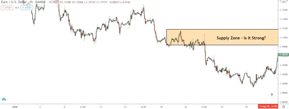
Let’s give this zone a once-over, since it’s recent… and looks pretty sweet.
Step 2: Look At The Increase In Shorts/Longs When The Zone Formed
Now we’ve found our zone, we need to pinpoint when it formed on the COT graph and see if there was a surge in the number of net-shorts (for supply zones) or net-longs (for demand zones) during that window.
So, let’s get cracking…
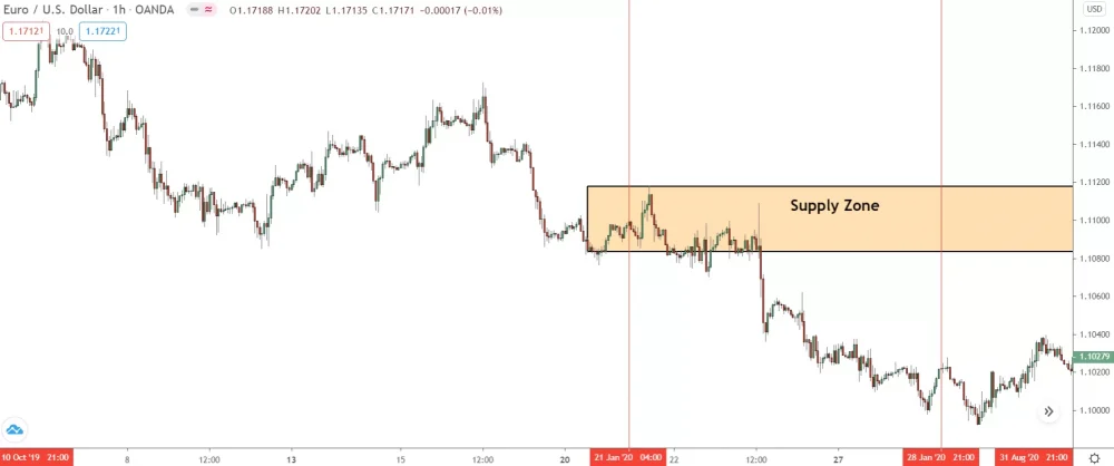
In this instance, our zone formed between the 21st and 25th of January.
Given the COT graph only gets updated once a week, we need to locate the figures for those weeks and check if the longs/shorts climbed or dipped – only zones with an uptick carry weight. You do this by putting the number from the week the zone formed head-to-head with the numbers from the previous weeks.
What we’re really hoping to spot is a BIG uptick – a significant leap.
A minor uptick still holds water – those trades gotta go somewhere, right?
But, a major uptick is really what we’ve got our sights set on… it signals the banks entered a large number of new positions, telling us that whatever zone formed as a result must pack a punch.
So, let’s take a gander at the graph, shall we…
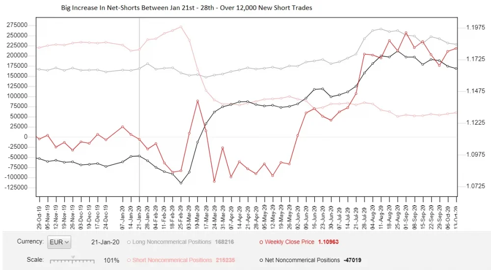
Our zone formed on the 21st of January, which implies we need to draw a comparison between the stats for that week – the COT releases every Friday – and the figures from the previous week.
The disparity will provide a snapshot of the size of the increase/decrease, giving us a sneak peek into the zone’s strength.
For the week when the zone formed, the graph shows were 239,515 sell trades lying open in the market from the banks. Juxtapose that with the week before, when only 215,235 were open, and we discern a difference of 24,280 sell trades – a massive leap week over week.
With this intel, we know the banks…
- A – Placed more sell trades during the week the zone formed.
- B – Want price to continue its downward spiral – why else would they sell?
The puzzle we need to solve now is: Where did the banks position most of these sell trades?
While the supply zone is the easy guess, we can’t just leap to the conclusion they were all dumped at the zone… it’s too simplistic. We need to take a closer look at what else happened during the week, check if any other zones also fit the bill.
Let’s dive in…
Step 3: Check For Other Zones/Price Action During The Increase
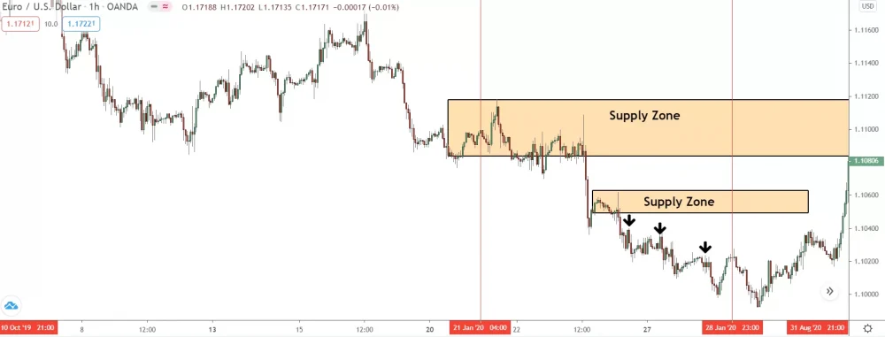
If we scrutinize the week of the increase, shown between the two vertical red lines, we notice a plethora of bearish price action but not much bullish activity – par for the course in a plummeting market.
Our zone is nestled near the start of the week, but then something happens…
A small supply zone emerges.
This zone isn’t a standout by any measure, but it has formed from the banks placing a sizable chunk of those 24,000 fresh sell trades. The tiny swing highs took shape between the 24th and 26th are also the offspring of these trades.
They could only form if price took a dip, which implies the banks sold here too.
Remember: the banks can only sell when price is rising and buy when it’s falling.
It’s a common myth to believe bearish PA equals banks selling… but that’s not the case. The selling primarily stems from retail trades entering short and closing losing buy trades.
So, how do we decipher where the banks entered these new sell trades?
Well, you employ what I explained in last week’s guide…
You look at the move before the zones formed and stack them against one another… which had the longer preceding move: our supply zone or the smaller zone that formed later that week? The same applies to the swing highs.
What was their preceding move like: a small upmove or a large upswing?
The length of the preceding move reveals how many retail traders were buying before the zone formed, and therefore, the size of sell trades the banks could roll out, revealing the power of the zone.
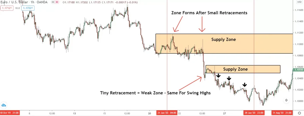
With its retracement… our supply zone clearly takes the cake here.
Compared to some zones we’ve checked, its move is hardly anything to write home about. During this brief flicker of price action, however, it’s the only time price was genuinely on an upswing. The other zone formed after a small pause – something that seldom ropes in many traders to buy.
The swing highs?
All formed from minuscule rises too, so they’re out of the running.
So, it’s crystal clear: the lion’s share of the banks’ 24,000 new sell positions were entered at the upper supply zone.
We can claim, with high confidence, this is an institutional zone – we know it formed when the banks placed a sizable number of sell trades into the market.
Here’s how the action unfolded…
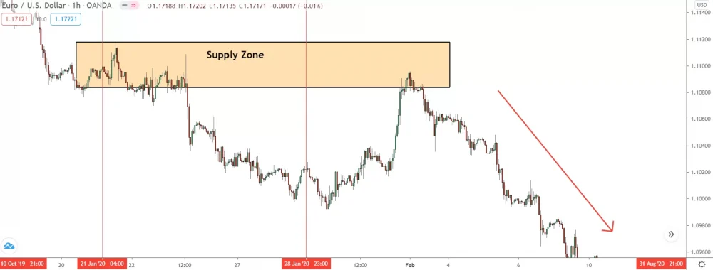
Once price returned a few days later, a large reversal ensured – see the power now?
The Bottom Line
While finding powerful supply and demand zones will never be a walk in the park, the Cot graph will give you a major leg up, and make the process a whole lot easier.
Try it out yourself for a while, and you’ll see what I mean.

Grab Your FREE E-Book:
5 Pro Rules For Trading Supply And Demand
- Master the core principles of supply & demand.
- Advanced techniques for trading SD zones.
- Exclusive new lessons/books/tools every week!
Sign Up Now To Download Your FREE Guide:
🛡️ Spam-Free Promise: No spam, ever. We'll only send you relevant updates and content. Unsubscribe at any time.

Hi Liam,
Thanks a lot for the free educative stuff. Just continue like that. It makes really sens.
Big Up.
Hi Liam,
Thanks a lot for the free educative stuff. Just continue like that. It makes really sens.
Big Up.
Great read but where do I find the COT graph ?
It’s in the email, Don. I highlighted “Cot Graph” tool with the link. Hit it, and you’ll get taken to the tool page. If you can’t find the link, let me know, and I’ll send another one over to you via email.
bonjour, superbe article, un veritable plaisir de vous lire et d’apprendre avec vous. pouvez vous mettre le lien , il ne fonctionne pas. merci pour tout
Very nice explain
Hi Liam,
Can you please send me your link for your VIP membership.
Thanks,
Hi Liam, powerful thoughts as always. Wouldn’t there be another tool that shows the COT report on a more frequent basis? So, instead of weekly, maybe every two days. Would there be anything like that?