
Finding good supply and demand zones is tough, like REALLY tough.
Sure, there are things you can do to make it easier – looking for a long preceding move or seeing if a zone has confluence with other technical factors being the two best methods. But, even with those, finding powerful zones is far from easy, especially if you’re new to S & D trading.
Luckily, I’ve found a tool that makes finding strong zones A LOT easier.
It’s called the Cot Graph!
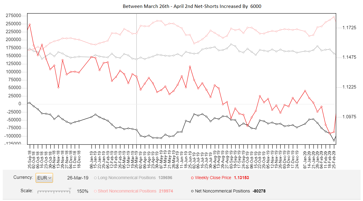
Using data from the Commitment of traders report, the Cot graph reveals when the banks have increased or decreased their number of open trades in the market (both long and short).
ESSENTIALLY: we can see when the banks are placing more trades.
By combing that with what I explain in my supply and demand books, we can use the data to figure out where the most powerful supply and demand zones have formed, making it much easier to find and trade strong zones.
Sound good?
Locating strong zones using the graph is easy enough, but there are a few steps to take to ensure you find the right zones and not the wrong ones – more on this later.
First, let me explain why the Cot graph is so good for finding powerful zones.
The Cot Graph – Why It’s So Useful For Finding Good Zones
Good supply and demand zones are a dime a dozen, and finding the best zones usually requires deep technical knowledge acquired over many years of trading.
Or, at least, it did…
Enter: the Cot Report.
Released every Friday, the Commitment of Traders report (Cot) details the positioning of traders in the futures, spot forex, commodities, and futures markets – and yes, that includes the banks. The report reveals whether there’s been an increase/decrease in net-longs (buy trades) or net shorts (short trades) entered into the market.
That means…
You can see whether the banks are entering/removing long or short trades and in what amount.
AMAZING, RIGHT!?
By understanding how the banks trade and using a little bit of math, you can use this information to determine where the most powerful supply and demand zones lie.
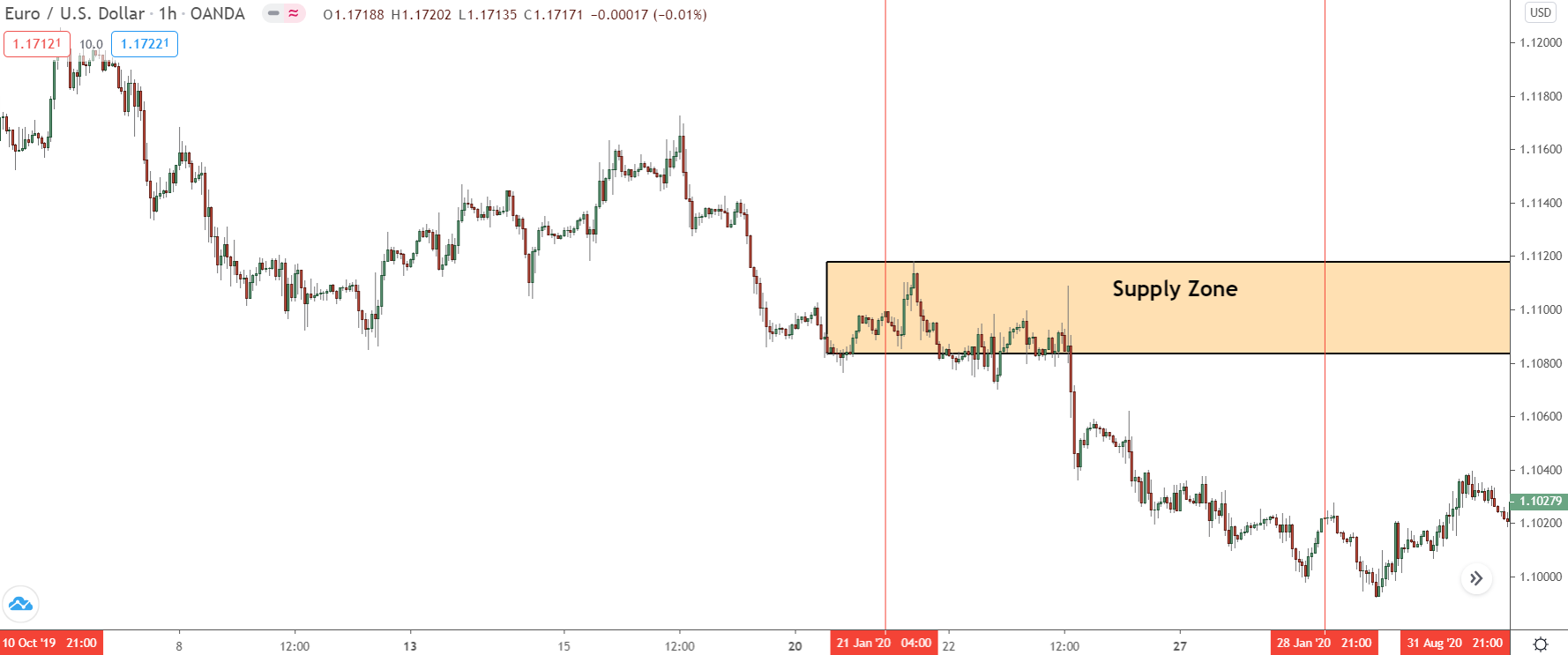
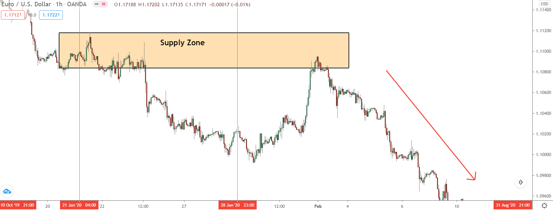
For example…
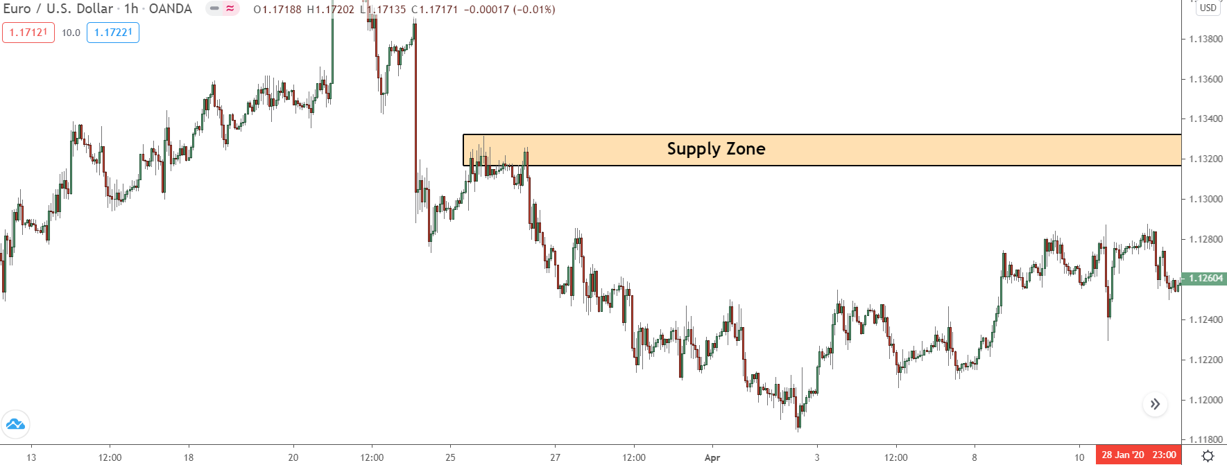
The zone above has a VERY high probability of causing a reversal.
How do I know?
Because during the week it formed, there was a massive increase in the number of sell trades placed by the banks.
This is clear if we check the Cot Graph…
By comparing the week the zone formed with the prior week, we can see that between the 24th and 27th of March, the banks entered 24,000 new sell trades – a HUGE increase!
These new trades had to get placed somewhere, but where?
Well, since the banks can ONLY sell when price is rising – as they need buyers to sell to – they must have been entered when price was rising during the week the zone developed. And given that the only time price really increased was right before the supply zone formed, that makes the zone the most likely point they entered these new trades.
And, as we can see…
Price soon reversed upon it’s return, confirming the banks entered their trades here.
This is the power of using the Cot graph – it makes finding strong zones a breeze!
Now, let me show you how to do this yourself…
How To Find Zones Using The COT Graph – My 3 Step Method
You don’t need to be a genius to find institutional zones with the order graph… I’m evidence of that.
But, you must go through the correct steps in the right order, so you actually locate the good zones and not the weak ones.
This where I come in!
To help you along, I’ve created a simple three-step method for finding institutional zones using the COT graph. These 3 steps make it easy to take the data from the graph and use it to find the right zones; no experience necessary.
Just follow the steps, get the data, and locate the institutional zone.
Easy!
Here’s what you need to do…
Step 1: Locate The Zone You Want To Check
First off, locate the zone you want to check using the Cot Graph.
With this method, we don’t “find” new zones per say, but rather check existing zones against the graph to see which formed from the largest number of trades being placed.
We’ll look at this zone, since it’s recent… and looks kinda nice.
Step 2: Look At The Increase In Shorts/Longs When The Zone Formed
Now we’ve got our zone, we need to find when it formed on the COT graph and see if there was an increase in the number of net-shorts (for supply zones) or net-longs (for demand zones) during that time.
So, lets do that…
In this case, our zone formed between the 21st and 25th of January.
Since the COT graph only updates each week, we need to find the figures for those weeks and check if the longs/shorts increased or decreased – only zones with an increase are powerful. You do this by comparing the number given the week the zone formed with the previous weeks numbers.
Ideally, we’re looking for a BIG increase – a significant jump higher.
A small increase is still important – those trades must be placed somewhere, remember.
But, a big increase is really what we’re looking for… it reveals the banks entered a large number of new traders, telling us whatever zone formed as a result must be pretty powerful.
Looking at the graph, then…
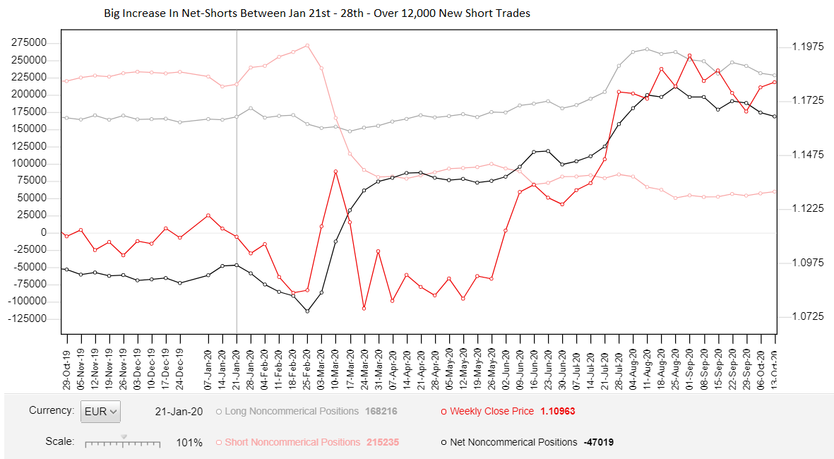
Our zone formed on the 21st January, which means we need to compare the figures for that week – the COT releases every Friday – with the figures of the previous week.
The difference will tell us the size of the increase/decrease, giving us an idea of the zone’s power.
For the week the zone formed, the graph tells us there were 239515 sell trades open in the market from the banks. Comparing that to the week before, when only 215,235 were open, reveals a difference of 24,280 sell trades – a SIGNIFCANT increase week over week. With that in mind, we know the banks…
A – Placed more sell trades during the week the zone formed.
B – Want price to continue lower – why else would they sell ?
The question now is, where did they place most of these sell trades? While the supply zone is the obvious candidate, we can’t just assume they were all placed at the zone… it’s too simple.
We need to check what else happened during the week, see if any other, more suitable zones formed.
Lets take a look…
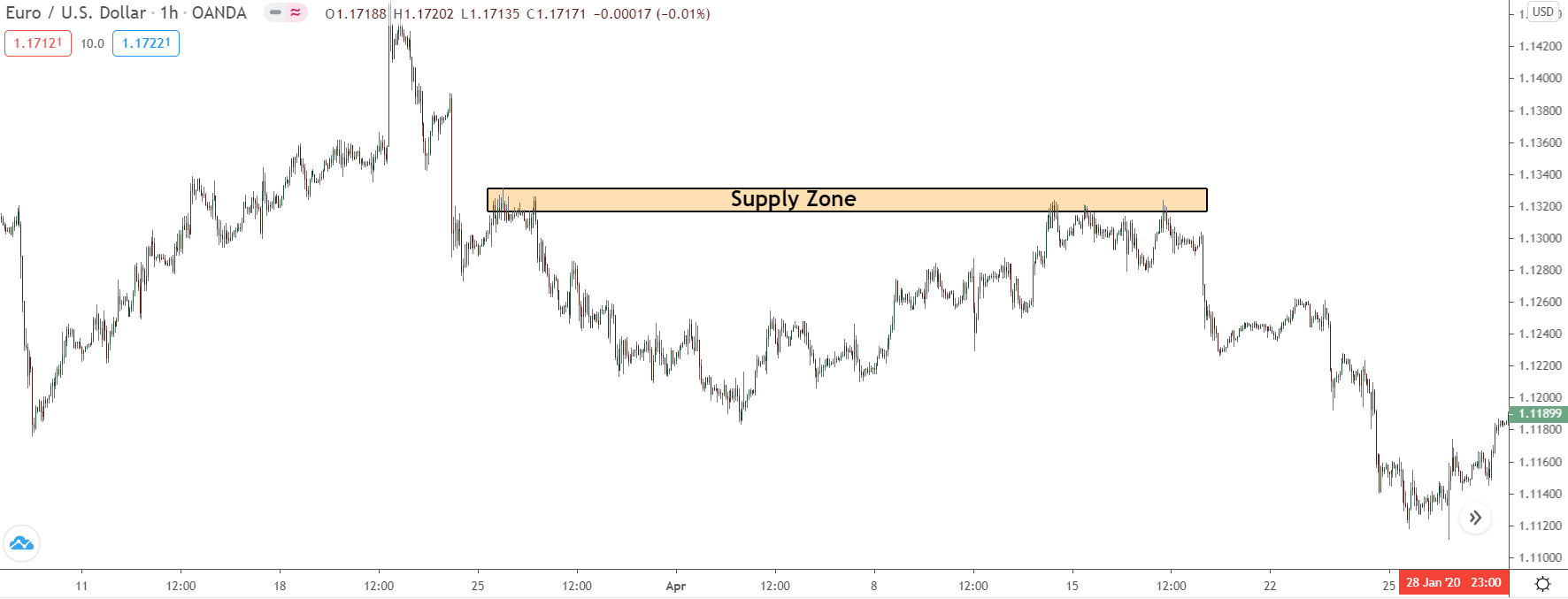
Step 3: Check For Other Zones/Price Action During The Increase
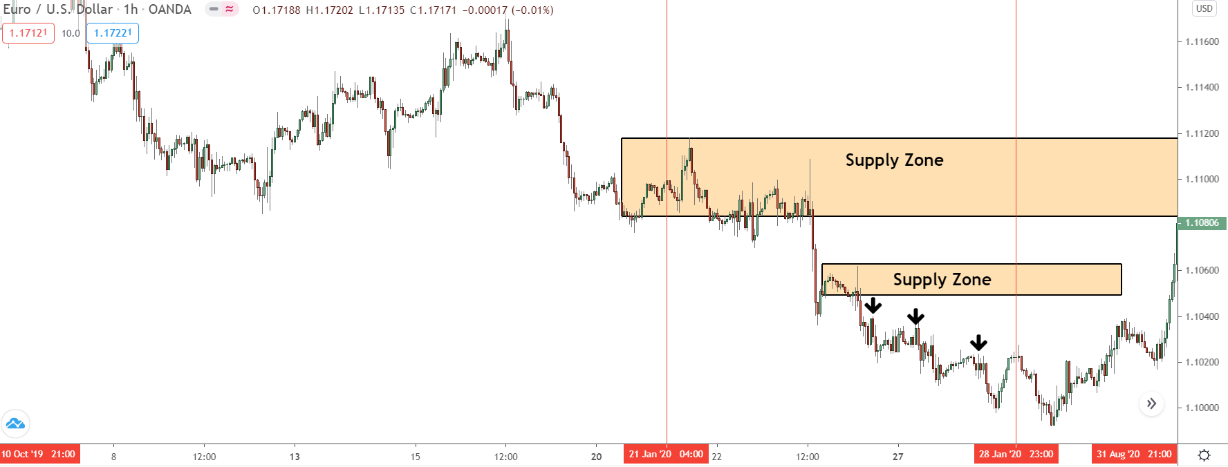
If we look at the week we saw the increase, marked between the two vertical red lines, we can see there was lots of bearish price action but not much bullish price action – which is what you’d expect in a falling market.
Our zone is located near the beginning of the week, but look what happened…
Another small supply zone forms. This isn’t a great zone by any means, but it has formed from the banks placing some of those 24,000 new sell trades. As did the small swing highs that formed between the 24th and 26th. They could only form if price moved lower, which meant the banks sold here too.
REMEMBER: the banks can ONLY sell when price is rising and buy when it’s falling/
It’s a common trap to think bearish PA = banks selling… it doesn’t!
The selling comes (mostly) from retail trades selling and closing losing buy trades.
So, how do we know where the banks placed most of these new sell trades?
Well, you use what I explained in last weeks guide…
You look at the move BEFORE the zones formed and compare them against one another… which had the longer preceding move, our supply zone or the smaller zone that formed later that week? Same goes for the swing highs.
What was their preceding move like: small or long?
The length of the preceding move reveals how many retail traders were buying before the zone formed, and therefore, what size sell trades the banks could place, revealing the power of the zone.
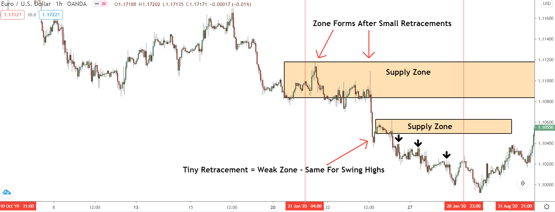
With it’s small retracement… our supply zone is the clear victor here.
Compared to some zones we see, it’s move is tiny, nothing to shout home about. During this small segment of price action, however, it’s the only time price was really rising. The other zone formed after a tiny pause – something that rarely many traders to buy.
The swing highs all developed from a tiny rises too, ruling them out.
SO it’s clear: most of the banks 24,000 new sell trades were placed at our supply zone.
We can say with confidence, this is an institutional zone – we know developed from the banks placing a significant number of buy trades into the market.
Here’s how it played out…
Once price returned a few days later, a large reversal ensured – see the power now?
The Bottom Line
Finding strong supply and demand zones will never be a walk in the park. However, the Cot graph will give you a major leg up, and should make the process a whole lot easier.
Try it out yourself for a while, and you’ll see what I mean.

Grab Your FREE E-Book:
5 Pro Rules For Trading Supply And Demand
- Master the core principles of supply & demand.
- Advanced techniques for trading SD zones.
- Exclusive new lessons/books/tools every week!
Sign Up Now To Download Your FREE Guide:
🛡️ Spam-Free Promise: No spam, ever. We'll only send you relevant updates and content. Unsubscribe at any time.
Hi, maybe am I confused, but please tell me, pictures ilustrate supply zone, text describes demand zone,… is there some purpose please? also link for the video ( “Liquidation And Sell Pressure”) is missing, can you please provide? Thanks in advance. V
No, you’re right Vilem – I’ve got the text wrong. I forgot I hadn’t gone back and re-edited this post. The video link isn’t even supposed to be there, it’s for my subscribers. I’ll do a quick update now, so everything is correct.
Liam.
i am subscribed to the Vip membership and it seems there is more to this, is there any other subscription for the video’s ??
I have subscribed to VIP membership also and I really wonder about videos ? How can I reach them.Thanks.
There aren’t any videos yet, Koel. I think I’ll be putting some out next year, once it update the books. I want to update them first as they’re not in the best shape right (grammar and spelling wise). As soon as that’s done, I’ll get a few videos out, help explain some of my more in-depth concepts.
Hi,
I am going to start really diving into using this report and want to be crystal clear on the time window I should be using for the analysis.
According to the CFTC: “Generally, the data in the COT reports is from Tuesday and released Friday. The CFTC receives the data from the reporting firms on Wednesday morning and then corrects and verifies the data for release by Friday afternoon.”
Using the current reported period as a use case:
The Graph Date = Monday 14-Dec-20
Data as of Tuesday 15-Dec-20
CFTC receives data from reporting firms Wednesday 16-Dec-20
COT Report Published Friday 18-Dec-20
Questions:
I am analyzing some zones today which is Tuesday 22-Dec-20
Let’s say a I find a Zone formed on Wednesday 16-Dec-20.
Since the data is as of Tuesday 15-Dec-20 I cannot analyze this Zone yet Correct? I have to wait until this coming Friday correct?
Let’s say I find a Zone formed on Friday 11-Dec-20
And I want to compare long/short data from the week the zone formed with long/short data from the previous week
Turning to the Graph, I would be comparing the data points for 14-Dec-20 with 07-Dec-20 correct?
Thanks,
Michael
Yes, that’s correct, Michael. I never knew that was the process, to be honest. I thought as soon as they receive the data they put it out. I didn’t realize they verify it first. Interesting… But yeh, that’s how you would read the data. The zone on the 11th would use the data in the next release, not the data from that Friday. You then compare the data from that release (the 7th Dec) with the release on the 14th, which would give you the right figures to compare.
Hope this helps,
Liam
Can we use COT on all time frame?
Not really, Kbola. It’s more of a long term tool than a short term one. The graph only shows data from each release of the Cot, which is every week. So, you can’t really take the data and apply it to a low time-frame like the 5 min because the scale is too long if that makes sense? I’d say it’s fine for any time-frame above the 30 min. Any lower than that, and it gets messy figuring out where the banks opened/closed their trades due to the price action.
Where I can find this graph?