
Commitment Of Traders Chart
Get a sense of what the banks are up to with the commitments of traders graph. This graph shows the number of contracts (trades) non-commercial traders – banks, hedge funds, asset manages etc – have open in the market, as well as whether they’re open long or short. Look for changes to understand what the banks might be up to and how strong the current trend is (see below for more info).
Note: The report updates every Friday at 19.30 GMT in the summer and 20:30 in the winter. The data uses the futures market – a key driver in spot forex – and all currencies are paired with USD – i.e selecting Eur = Eur/Usd.
How To Read This Chart
There are many cool ways to use the COT report – provided you know how to read it.
The graph visually shows changes in open trades from commercial traders – mainly hedgers, who aren’t important – and non-commercial traders, like banks and hedge funds, so we can use it to get key insight into what the banks are up-to.
To read the COT report correctly, you must look at the non-commercials number and see how it changes from its previous number and also the numbers in the recent past. The changes will give you insight into you whether the banks are entering trades or closing trades and on what scale.
For example, if net-longs INCREASE from 232,000 to 241,000, it shows lots of big traders have entered long.
Why would they enter more trades? Because they think price will continue rising, therefore: expect the current trend/swing to continue.
The opposite is also true: if the number of net longs DECREASES, that could be a sign the banks aren’t confident price will continue rising, so a down-move may be on the cards.
Key Point: Never look at the numbers in isolation. Always view them against one another and see at the changes. Compare the most recent number with the previous number, what’s changed? Also, look at the numbers together; is there a trend?
Look at the recent history, and ask yourself:
Are the longs (or shorts) decreasing or increasing over time?
Is this sudden decrease (after a period of increases) a blip or a sign of a reversal?
These are the sorts of questions you need to ask yourself when reading the graph. They’ll give you the insight necessary to understand what the banks are doing and what price could do in the future.
3 Ways To Use The COT Graph In Your Trading
There’s a bunch of wide range of powerful ways to use the COT graph when trading – trend identification, anticipating trend reversals, analyzing trend strength, among others.
Here’s the top 3 I’ve found over the years…
Identifying The Trend
Trends form and take shape because of traders with big pockets – the banks – buying and selling. With the COT report, we can track this buying and selling – it is increasing, decreasing – and quickly see what the current trend is as well as a gauge its strength.
Consider the following example…
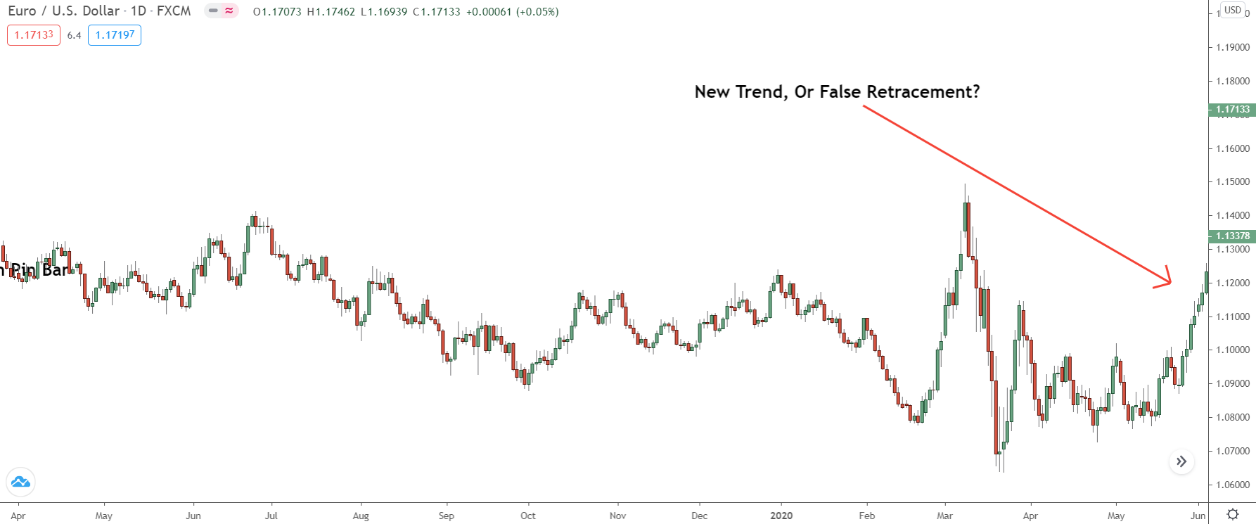
Price is moving higher, but how do we know this is a new trend and not a false retracement as we see so often in forex?
Well, we can check the COT graph…
If this is, in fact, a “real” move, we should see a consistent rise in the number of net longs… that would reveal the banks are placing more buy trades as price rises – a sign they expect it to continue higher.
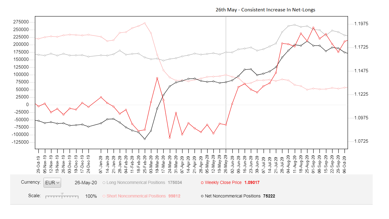 Switching to the graph, it’s clear: the banks are DEFINITELY buying more during this rise.
Since the reversal, the COT has been released 5 times, with each showing a consistent increase in the number of net longs (buy trades) placed into the market – and a decrease in net shorts. Confirmation a trend or large upswing is underway, and price is probably going to continue higher over the next few weeks, which, of course, it then does.
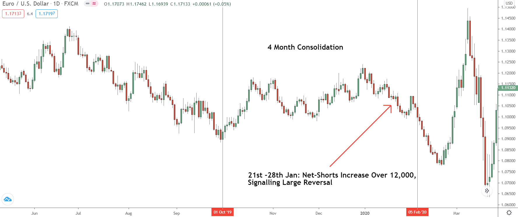
You can use the graph to identify consolidations too…
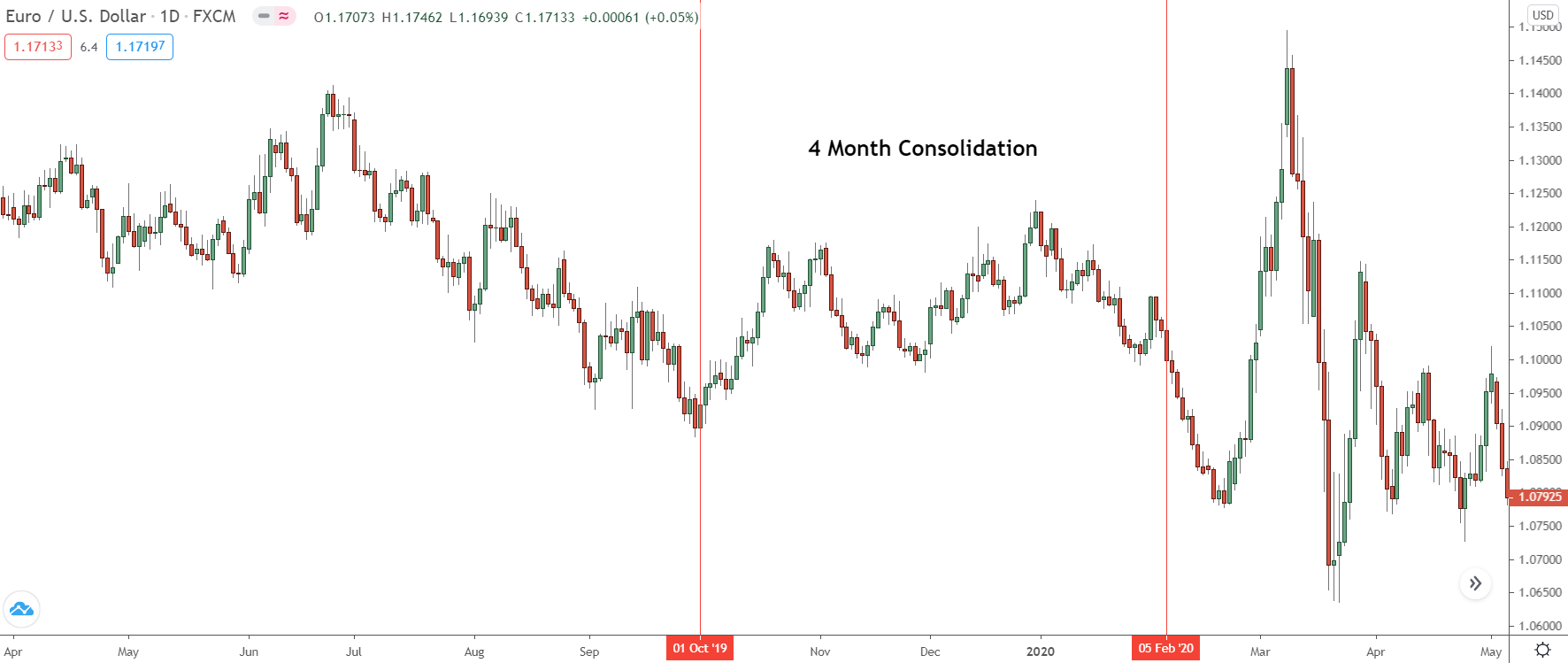
Between October 2019 and January 2020, Eur/Usd moved sideways; there was no trend.
With hindsight, that’s obvious! At the time, however, it wasn’t clear when this consolidation began or how long it had been in play. If we look back at the COT graph, however, we can see the inklings of a consolidation way back in September … a full month BEFORE the consolidation started.
See for yourself…
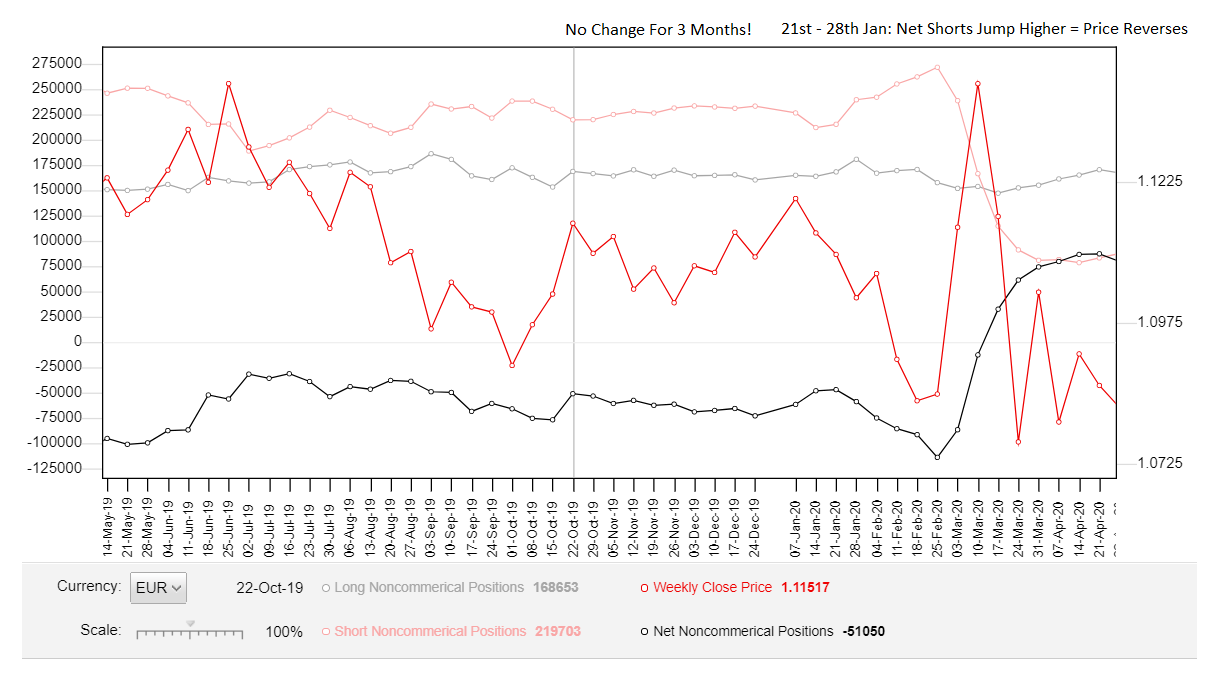
On the COT, there was almost NO change in the net-short and net-long trades for nearly 3 months!
Each increase in net-short or net-long trades was met with a similar opposing decrease a short time later, leading to both lines being flat for almost 3 months! If that’s doesn’t tell you price is consolidating, I don’t know what will. And what happened when there was a significant increase in short trades on the 27 Feb?
A HUGE down-move ensured…
Just another great way you can use the COT graph in your trading.
Key Point: While a big increase in open trades often signals a strong trend, sometimes, it’s the opposite. If you see a large increase after the trend has been in play for a while – kind of like what we’re seeing on Eur/Usd now (09/10/20) – it can indicate a blow-off top, making a deep retracement or even reversal likely.
Anticipate Major Reversals
Getting into large reversals BEFORE they begin is the goal of every forex trader, and it’s something else the COT report can also help you out with.
The key to anticipating reversals with the COT is to watch for extreme readings. Look for the number of net short or longs to reach extreme levels, specifically, after price has been trending in the same direction for a while with no recent deep retracements or long drawn out consolidations.
Together, those are typically great signs price could be about to reverse.
Here’s an example…

Remember this reversal on Eur/Usd?
Before price reversed here, the market looked extremely bullish, like a new upswing or trend was beginning. However, a couple of months later, price dramatically reversed, and a new downtrend got underway. Using normal TA methods, you probably wouldn’t have seen this coming.
But looking at the COT graph, it’s clear something was up.
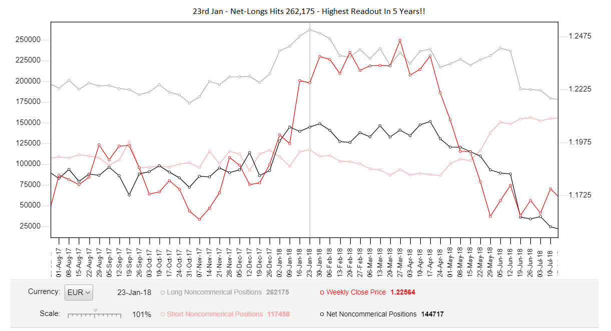
For 6 weeks in a row, the net-long number made a new high every week – see that? On Jan 23, the number of net-longs reached 245,000 – it’s highest readout in OVER 5 YEARS!!
With such an extreme number long, price expectations are obviously at a high – why else would so many be long?
Also, check out the number of net open short trades… after falling for a while between Jan – April, it’s put in three weeks of consecutive higher numbers, telling us traders are starting to enter more and more short positions.
Who buys when everyone is long, and price is trending higher?
Now, taken together, these are pretty ominous signs…
We have a long uptrend with no recent deep retracements or consolidations – a requirement for trends to continue, as I explain in my books. The number of open long trades is at a 5 year high; everyone and their dog is long right now. And to top it all off: the number of net shorts is rising – who sells when everyone is buying?
However, this doesn’t mean a reversal is going to take place – we need to see tangible price action for confirmation, such as seeing a sharp decline or a big bearish engulfing pattern or two form.
As is it turns, that’s exactly what happens…
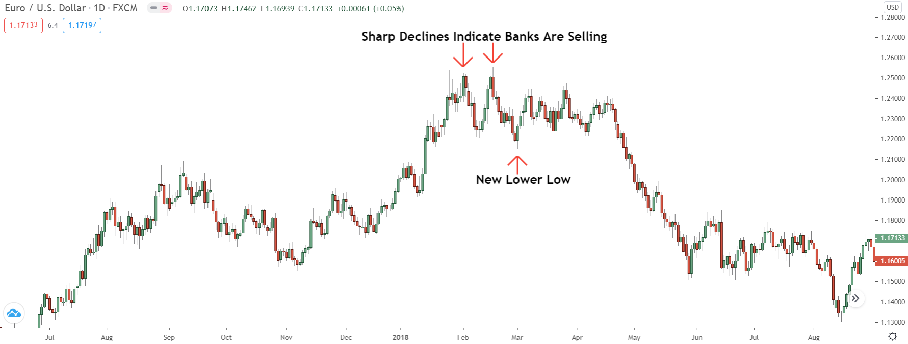
We get two sharp declines, with the second making a new lower low.
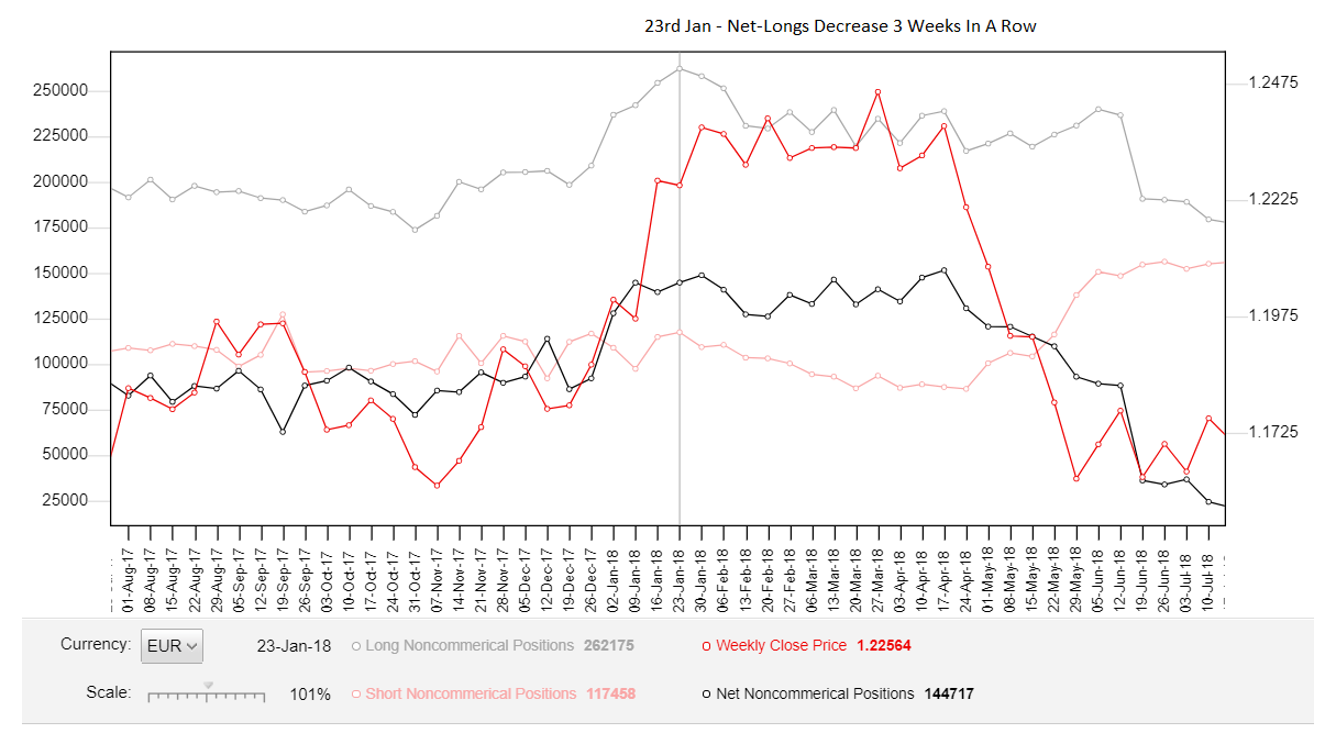
The graph also showed a decrease in the number of open longs trades for 3 weeks in a row. I wonder why the banks would be closing their longs and INCREASING their shorts when everyone is buying and the market is extremely bullish?
…Maybe because they know something we don’t?
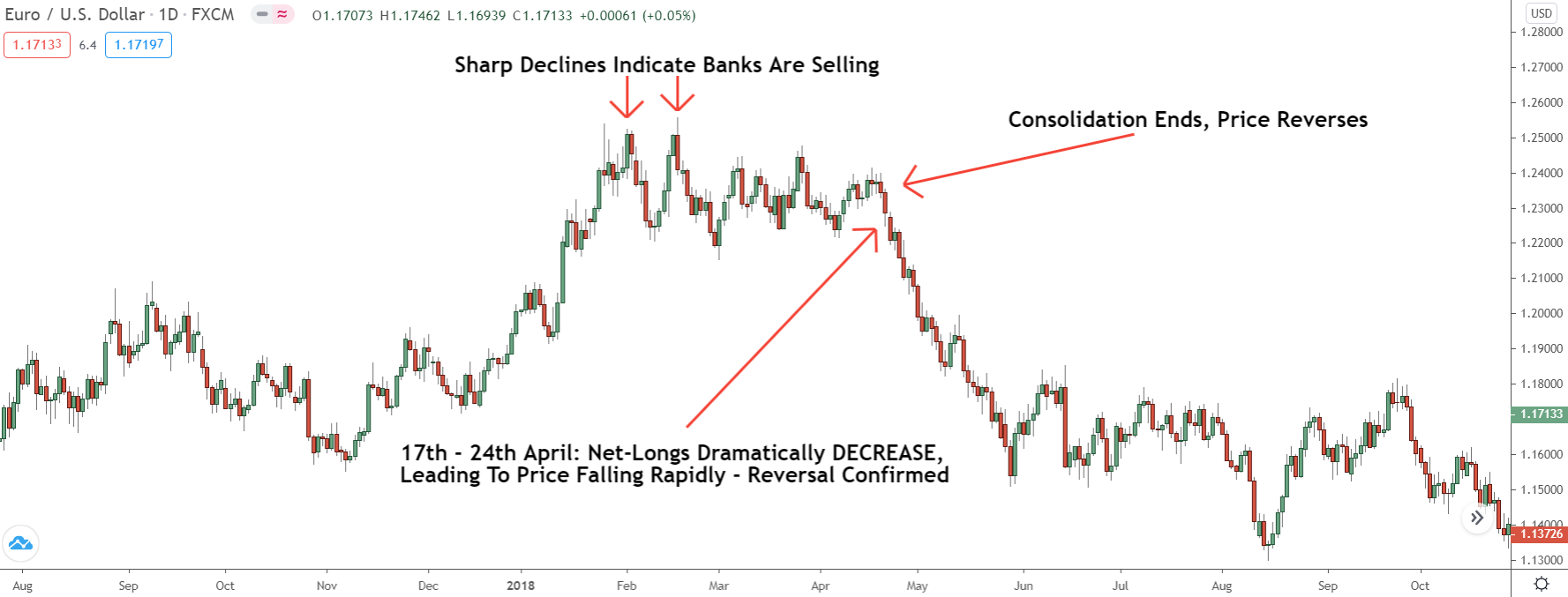
Together, then, these signals are confirmation price has a high probability of heading lower, either as a result of a deep retracement or from a large trend, changing reversal.
In our case, it’s the latter: after a 3-month consolidation, price reverses, and a new downtrend gets underway.
Confirmation of this came from the COT graph, which registered a significant DECREASE in the number of net longs between the 17th and 24th of April – again, why would the banks be closing their long trades? This was followed by a large INCREASE in the net shorts the week after, signalling the banks were now entering major short positions.
Take some time and study this for yourself… go back and see what the COT graph was showing, how the net longs/shorts changed before old reversals took place.
Most of the time, you’ll find the graph hinted a reversal was near through changes in the net longs/shorts.
Learn to spot these changes, and you’ll be to anticipate many of the biggest reversals before they begin, allowing you to get head start on everyone else in the market.
Finding Strong Supply And Demand Zones
Finding strong supply and demand zones is usually quite difficult, but it’s something else the Cot graph can really help you with and make a whole lot easier.
With the graph, you can quickly determine whether a zone is powerful or not by seeing whether it coincides with a large increase in open long or short trades.
Here’s how it works…
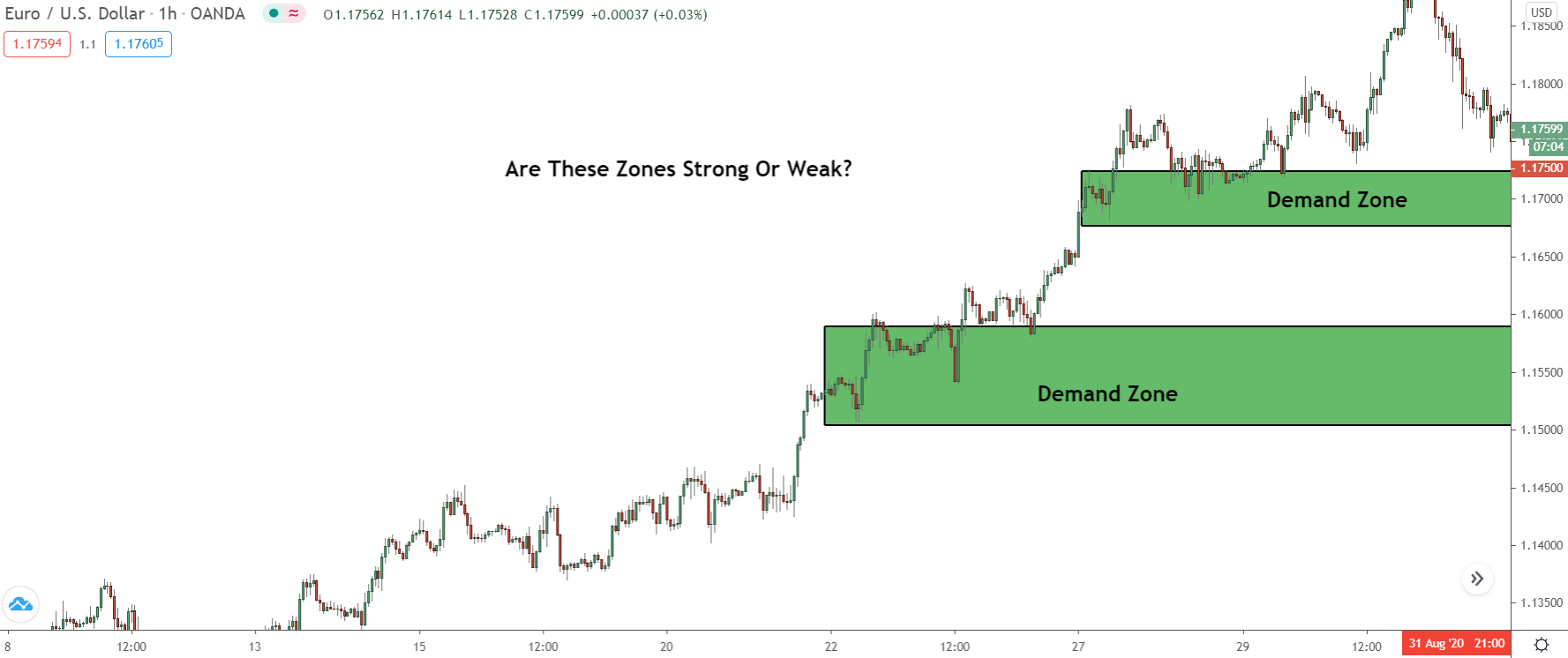
Let’s say you wanted to find out whether this supply zone is powerful or not.
What you would do is go onto the COT graph and check to see whether there was a large increase in open SHORT trades (net short, on the graph) during that time. If there was, the zone is probably quite powerful, because remember…
The banks CAN ONLY sell when other traders are buying.
That means when this increase took place, the banks could only enter their sell trades when price was rising. If you look back at the chart, the only time price actually rose during this decline, besides the tiny swings at the bottom, was when the supply zone formed. So, that must be where they entered most of these new sell trades.
Switching over to the graph…
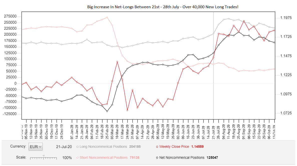
We can see there was a sharp increase in the number of open short trades between the 21st -28th of January, from 215,000 to 239,000 – a BIG increase, all things considered.
Most of these trades were placed BEFORE the supply zone formed, as that’s when price was rising.
So if price comes back to this zone in the near future, we know it’s got a great chance of resulting in a reversal because the banks have entered a large number of short trades at the point its formed.
And what do you know…
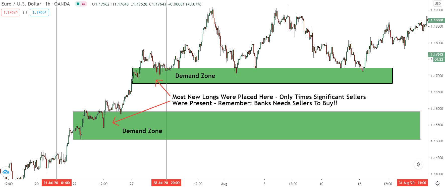
Once price returned to the zone, it reversed, setting off another big down-move.
That’s the power of using the COT to find good zones!
Being a Drop-Base-Drop zone meant we probably wouldn’t have even considered this for trading. Looking at the COT, however, reveals the banks placed a significant number of short trades to create zone, making it extremely powerful, and giving price a high probability of reversing once it returns.
If you want to learn more about how to find strong zones using the COT graph, check out my VIP post:
How To Find Institutional Supply And Demand Zones With The Cot Graph
I’ll cover the process in more detail, give you a step-by-step breakdown of what you need to do, and run through a few more examples so you pick up it easily.