General Supply And Demand FAQ’s:
What Is Supply And Demand Trading?
So, let’s get straight to the point.
What is supply and demand trading in forex?
In short: It’s all about identifying the areas, or ‘zones’, on a price chart where the currency has previously changed direction.
These reversals happen because of an imbalance in supply and demand. When there are more buyers than sellers (demand is higher than supply), prices go up. And when there are more sellers than buyers (supply is higher than demand), prices go down.
Simple, right?
These key zones are where the key market players – banks, hedge funds, etc. – have placed their orders and trading positions.
Remember: As individual traders, we can’t influence the market, but these big guys can.
So, our job is to figure out where they’re likely to jump in.
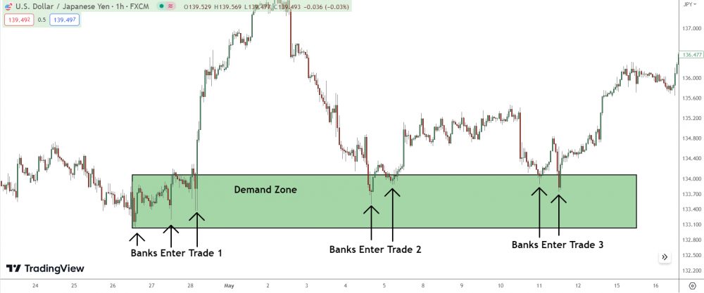
Once we’ve identified these supply and demand zones, we watch for price to return to these areas.
The goal is to ride the reversal when these big players step back in and cause the price to bounce back in the opposite direction. It’s not about pinpointing the exact price, but rather about identifying an area where the balance between buyers and sellers (aka the banks) is likely to shift.
What Are The Key Concepts In Supply And Demand Trading?
At its core, supply and demand trading operates under a basic economic principle: prices are driven by the supply (selling pressure) and demand (buying pressure) in the market.
But as a trader, the secret sauce lies in understanding how this principle translates into actionable trading decisions.
First off, you’ve got ‘Supply Zones‘.
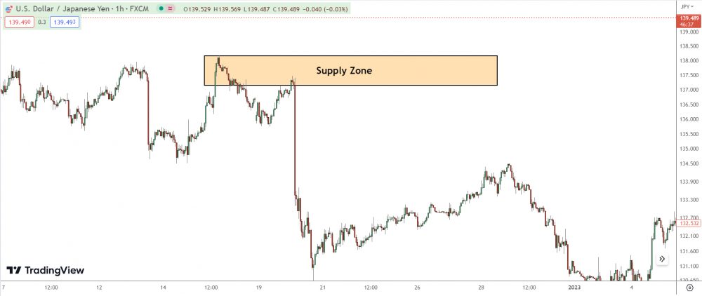
These are price ranges where sellers outnumber buyers, causing price to drop. When price revisits a supply zone, there’s a good chance it’ll fall again due to excess supply.
On the flip side, we have ‘Demand Zones‘.
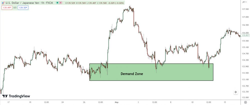
These are ranges where buyers outnumber sellers, causing price to shoot up. If price comes back to a demand zone, expect an uptick as demand outstrips supply.
Now, here’s the twist…
Not all supply and demand zones are created equal.
Some are ‘Fresh Zones’ – zones that price hasn’t returned to since their creation.
Fresh zones are highly valuable because they often have an abundance of unfilled orders, leading to stronger reactions.
And let’s not forget ‘Proximal and Distal Lines’.
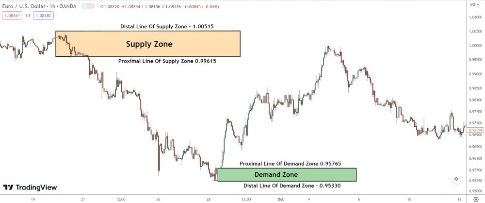
The proximal line marks the beginning of the zone (where price turned around), and the distal line marks the end of the zone (the last point before price changed direction).
These lines define your zones and can be your guide to potential entry and exit points.
Supply and demand trading is all about observing, understanding, and anticipating market reactions at these key zones zones.
What Is The Role Of Banks In Supply And Demand Trading?
Big banks and institutions play a key role in creating supply and demand zones.
These major players have deep pockets, and move enormous volumes of currency on a daily basis. Because of the sheer size of their transactions, they can significantly influence the supply and demand of a currency pair, and consequently, its price.
Imagine for a second, a large bank decides to purchase a massive amount of a specific currency. The demand for that currency will shoot up, causing a rise in price.
On the other hand, when a bank decides to unload a significant chunk of currency, the supply exceeds demand, leading to a decline in price.
But here’s the kicker: these institutions are savvy.
They often split their orders across multiple price points to mask their trading intent, creating what we know as supply and demand zones.
In essence, understanding the behavior of banks and institutions—and the supply and demand dynamics they create—gives us a crucial edge in forex trading.
Don’t forget: It’s not about outsmarting the big players; it’s about hitching a ride with them.
Can Supply And Demand Trading Be Used In All Types Of Markets?
Absolutely!
Supply and demand is a universal concept that applies to virtually all markets.
Whether we’re talking about the Forex market, stock market, or even commodities – the laws of supply and demand always hold true.
At its core, any market is simply a place where buyers and sellers interact.
When more buyers want a certain product (or currency, or stock, or commodity) than what’s available, demand exceeds supply. This leads to prices rising as buyers are willing to pay more to secure their share.
The point where price begins rising we call a demand zone.
On the flip side, if there’s a surplus of a product with not enough buyers, supply exceeds demand.
Sellers might then lower their prices to attract buyers.
That’s our supply zone.
In trading, these dynamics form patterns that can often give traders a heads-up on price movements. So, whether you’re trading oil, Apple , Bitcoin, or any other asset, you can definitely use supply and demand as part of your trading strategy.
Just remember, it’s not foolproof.
While supply and demand zones can give you a good idea of where price might turn, there are no guarantees. Always consider other factors and use proper risk management.
What’s The Difference Between Support/Resistance And Supply/Demand Zones?
Support/Resistance and Supply/Demand are two key concepts in trading, but they are NOT the same thing.
So let’s clear up any confusion.
Support and resistance are specific price points or narrow price ranges that a security’s price has had difficulty crossing historically.
Think of these as boundaries that price struggles to break.
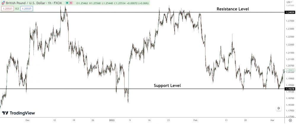
Resistance is like a price ceiling that the currency has struggled to move above, while support is a price floor that the security has struggled to drop below.
On the other hand, supply and demand zones aren’t as precise.
They are wider price ranges within which buyers (demand) and sellers (supply) have previously entered the market in large quantities.
These zones encompass the battlefield between buyers and sellers, so to speak.
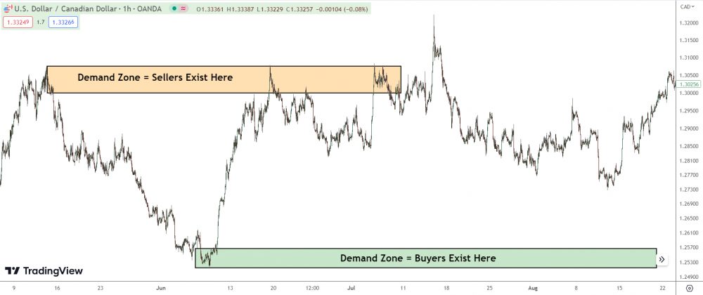
Supply zones are price ranges where sellers have overwhelmed buyers in the past, leading to a price drop. Demand zones are the opposite—price ranges where buyers have previously overwhelmed sellers, leading to a price increase.
In essence, while support and resistance levels are static price barriers, supply and demand zones are dynamic price ranges reflecting the aggregate buying and selling pressure.
Make sense?
What Are ‘Rally, Base, Rally’ And ‘Drop, Base, Drop’ In Supply And Demand Trading?
So, “Rally, Base, Rally” and “Drop, Base, Drop” are two essential concepts in supply and demand trading.
Let’s break them down.
Starting with “Rally, Base, Rally” (RBR).
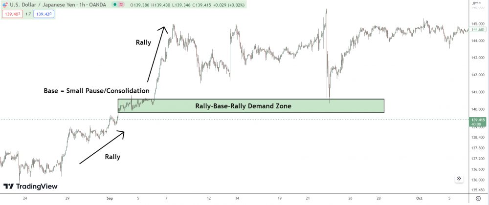
This is a pattern that forms a demand zone in the market.
In layman’s terms, it’s a sign that the price is likely to go up. Here’s how it plays out: firstly, we see a rally – a strong upward price movement.
Next, the market enters a consolidation phase, which we call the base.
Finally, another rally ensues, often with even more power.
This action forms a demand zone, which is where buyers have previously taken control of the market and pushed prices higher. The base is where institutional buyers have loaded up on their positions, making it a hotbed of demand.
If price revisits this area, these buyers often step in again, making it a great spot for a potential long trade.
On the flip side, we’ve got “Drop, Base, Drop” (DBD).
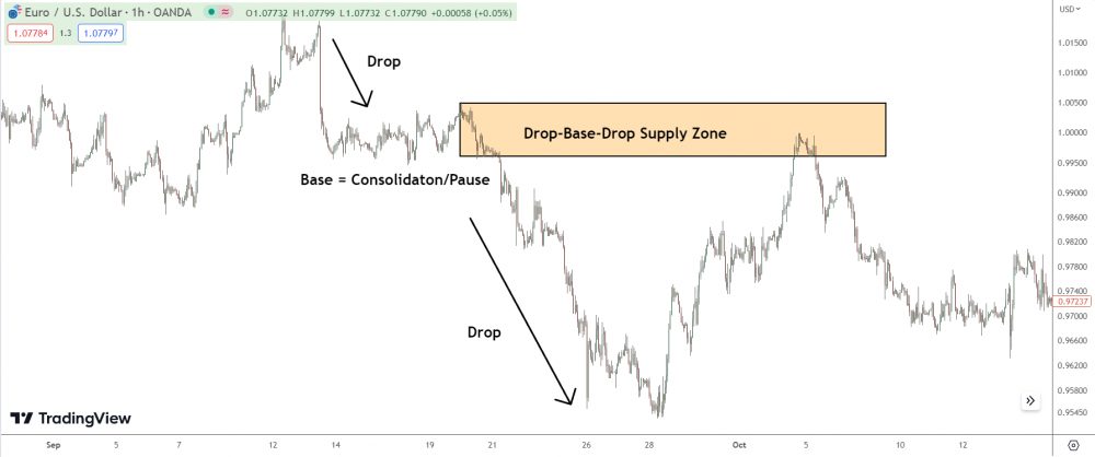
This is basically the mirror image of RBR and represents a supply zone in the market.
The DBD starts with a price drop, then enters a base or consolidation period, and ends with another drop. Again, the base represents an area where institutional sellers have offloaded their positions. If price retraces back to this zone, it’s likely these sellers will re-emerge, making it a potential area for a short trade.
Understanding these two patterns can give you powerful insights into where major market players may drive the price, offering fantastic trading opportunities.
But remember, always use these in conjunction with other analysis methods to increase your odds!
How Do You Identify Supply And Demand Zones In Trading?
To identify supply and demand zones, we need to pinpoint areas on the chart where the price has made a strong advance or decline.
See, supply and demand zones aren’t just arbitrary areas. They’re places where heavy buying or selling occurred, creating a battlefield of sorts between buyers and sellers.
A demand zone is typically formed after a strong rally.
Why does this matter?
Well, this is where price rocketed upwards, indicating a strong demand.
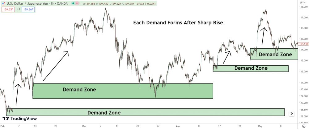
To find these zones, look for a quick, sharp rally away from an area.
The starting point of that rally is your demand zone.
On the flip side, a supply zone comes into existence after a steep drop, a clear signal of an abundance of supply.
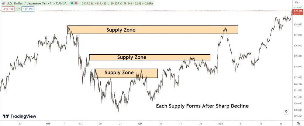
To identify a supply zone, look for a spot where price made a strong move downwards.
The point of origin of that fall is your supply zone.
The goal here is not to find every single supply and demand zone. Instead, we want to identify the key zones where major price movements occurred. Once we’ve got that down, we’re in a good place to predict future price movements with more confidence.
Over time, you’ll develop a keen eye for recognizing supply and demand zones.
How Do You Draw Supply And Demand Zones In Trading?
The process of drawing supply and demand zones in trading is more of an art than a science. But let me break it down into easy-to-follow steps.
Step 1: Identify Swing Points
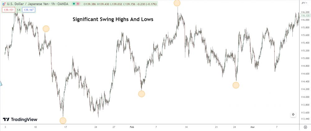
Start by identifying the major swing highs and swing lows on your chart. Swing highs typically represent supply zones, while swing lows represent demand zones.
Step 2: Map Out the Base
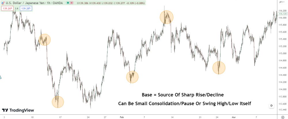
Once you’ve found a significant swing high or low, look for the “base” – this is the pause or consolidation before the price sharply moved up or down. The base is essential as it represents a significant battle between buyers and sellers before one side took control.
Step 3: Draw the Zone
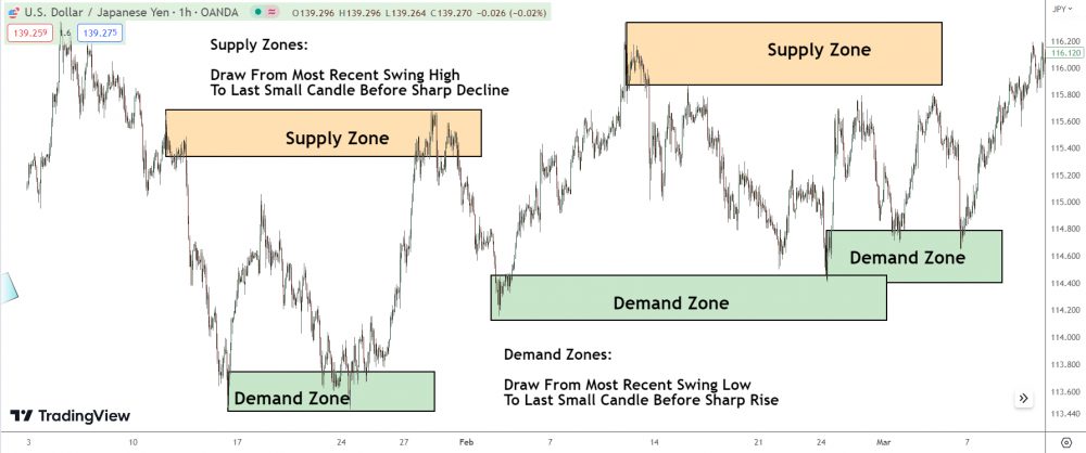
Draw a box from the high to the low of the base.
Extend this box to the right of your chart to create a “zone.”
Some traders include the entire consolidation area within the zone, while others only include the base. Either way, mark the area where the balance shifted between supply and demand.
Remember, these zones aren’t exact price points.
Instead, they’re areas where we expect a reaction based on the imbalance of buyers and sellers in the past.
Step 4: Future Interactions
Monitor these zones for future price interactions. When the price re-enters a supply or demand zone, you can anticipate a likely reaction.
This is where you can look for potential trade setups.
And there you have it!
Drawing supply and demand zones isn’t about precision or specific numbers—it’s about understanding where the big players have shown their hand.
EMAIL FAQ’s: Your Questions Answered
Question: What Price Action Invalidates A Supply Or Demand Trade?
I really enjoyed the books, and I have gone through all of them and even all the articles. After trading for some time, I had thought of 3 questions that I wanted to ask you.
Question 1
Do you have a set of rules you follow to invalidate a trade? Do you ever close a trade early or should price hitting the stop loss be the only invalidation? Right now my biggest issue is that I have been closing my trades early and taking profits before my targets hit. Would a better plan be to just hold the position until it either hits my target or stop loss?
Question 2
Sometimes when the price hits a zone it would create a large engulfing that makes it look like a new zone is formed.
How would I know whether this a new zone or just a reaction?
Question 3
Another issue I have been having is that when the price reaches my stop loss the transaction would actually be for a price much further away than where I set my stop loss. This is because of the slippage caused by my stop loss market order.
I’m having trouble maintaining my Risk to Reward ratio due to the slippage.
Do you ever face this issue?
Should I use stop limit orders instead?
Thank you for taking the time to read this. I hope to hear from you soon.
Regards,
Response:
Hey…
Glad you liked the books!
Here are my responses to your questions:
Q1: Typically, a swift price movement in the opposite direction invalidates my supply or demand zone trade.
If that happens, I’ll manually close the trade 90% of the time, especially if it’s due to news events.
For minor, one or two candle declines, I’ll keep it open and wait for more price action.
It’s sensible to hold the trade until the price hits the stop or target. I usually trail the stop with the trade, waiting for the market to close me out, unless I spot a sudden directional shift.
Q2: A new zone is only valid if it creates a zone on a higher timeframe.
If, for instance, price falls into 1-hour demand and leaves with a bullish engulf, indicating a new 1-hour zone, it’s only valid if it’s created a daily or 4-hour demand.
If not, ignore the zone.
It’s likely a reaction to the initial 1-hour demand, not a new zone.
While the price may reverse upon returning, it’s not a ‘fresh’ zone with a high reversal probability.
Q3: Experiencing significant slippage in forex is unusual, unlike stocks.
Check out what might be causing the slippage; normal market movement shouldn’t cause it unless you’re trading really illiquid pairs. Try to close the trade manually when it happens. If this doesn’t work, I’d consider switching brokers.
Regular slippage that impacts your R/R isn’t normal.
There’s definitely something off with your trades or broker.
Question: Which Timeframe Zones Do I Use?
With multiple supply and demand zones for different time frames, how does one choose which one to use?
Thanks in advance.
Response:
The supply and demand zone you should use aligns with your trading time-frame. I usually trade off the 1-hour chart. Hence, the 1-hour supply and demand zones are what I typically use to spot promising trades. Daily zones also pack a punch, but it takes time for the market to move into these zones.
So while the market is taking time, I look for opportunities in the 1-hour zones.
Question: Why Should The Base Of A Zone Be Tight/Compressed?
Hey,
Great homepage you got.
Question: Why should be a “Base” of a Supply and Demand zone compressed/tight for better results?
Thanks =)
Response:
Hey,
Just laying it out there – zones with bases don’t increases the probability a supply or demand zone will cause a reversal.
It’s all about the zone’s location within the market dynamics.
For instance, the market’s falling and a demand zone with a neat base forms.
This zone stands a better shot at succeeding than a demand zone that forms a base after price has already risen i.e a rally-base-rally zone. Why? The banks’ buy orders that formed the demand zone would have had to be significantly larger due to the masses of traders selling before the zone formed.
Question: What Price Action Signals A Reversal From A S/D Zone?
I think what I was trying to say was that I am able to find zones (of course not all zones are working but majority do give some kind of movement) but have troubles having good entry strategy.
The pinbars dont work for me, i see pinbars everywhere and im not able to differentiate the different pinbars that you are writing about.
At the community they just look for some kind of rejection and market slowing down but im usually too quick or too late. Tbh, i usually just get stopped out often. Its really annoying because it seems all the rookies are doing so well and Ive been trying to become profitable for like 3.5 years and Im still not.
I do feel Im really close and that its basically now having a good entry at the right time that is the issue.
Thank you,
Response:
So, you’re wrestling with entry points, not zone identification.
The truth: Pin bars aren’t the most reliable for signaling trade entries in zones.
They can hit the mark now and then, but consistency isn’t their strong suit.
Here are three strategies you might find more effective:
First up, take note of a sharp rise or decline leaving the zone.
If you see a sudden, dramatic shift comprising two or more candlesticks, it’s a sign the big players – the banks, hedge funds,. etc – have made a move.
They could be placing a large position or taking profits.
Either way, it indicates a likely zone reversal.
Aim to jump in after the second or third large range candle.
Once price leaves the zone, adjust your stop to the peak of the sharp movement.
Next on the list – keep an eye out for a large engulfing candle.
These often trigger significant shifts, so seeing one in the zone is a reliable hint a reversal is on the cards. Size matters here; a small engulf isn’t going to cut it. If the engulfing candle and the one it’s engulfing are dwarfed by the neighboring candles, look for other signals.
For clarity, check out my post on engulfing patterns.
Last but not least, keep your eyes peeled for a higher high (or lower low for supply zones) within the zone.
This strategy works best when price drives deep into the zone, rather than brushing the edge. Even if the above strategies don’t pan out or you miss the boat, this approach can secure some profitable trades.
Wait for price to breach a zone, watch for a slight retracement then, once price closes above the high (or below the low for supply zones) of the retracement, dive in. This method works because the higher high or lower low signals strong momentum – especially if the rise or drop is sharp.
While it may not always trigger a mega reversal, it should at least instigate a retracement that nudges price out of the zone, giving you a chance to adjust your stop and minimize risk.
Question: What’s The Best Entry Signal Into A S/D Trade
Hello, thanks for your response.
Yes, I get the book.
I find it super, what you publish anything and describe, but I understand only half. I like to spend rather learn through images. What do you think is a good sign that a zone work? For example, an “engulfing bar” or “pinbar”?
Rather take or zones from h4 chart, or h1 chart in the smaller time frames, such as m30 and there so looking for a start?
I’m sorry, sincerely, if I ask you so many questions, but thank you already now, for the time you apply.
I look forward to your reply.
Best regards
Response:
A large bearish engulfing candle is the most reliable signal for determining whether a supply or demand zone will result in a successful trade.
Using pin bars can be difficult since it’s challenging to figure out if they’ve formed due to banks taking profits or placing trades. The most effective zones usually originate from significant swing lows or highs, as I mentioned in the swing lows and highs book.
These are always created by banks either taking profits from trades or placing trades to cause market reversals. So, when the market enters these zones and produces an engulfing candle, it’s a strong indication the banks are either taking more profits or placing substantial trades.
In either case, expect a reversal.
Question: Does Price Breaking Lower S/D Zones Reduce The Strength Of Zones Above?
So I have another question regarding supply and demand that I still need to get my head around.
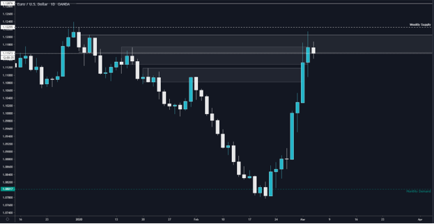
As we can see from this image of EURUSD on the daily, price has hit a monthly demand zone and then broken above 2 daily supply zones.
I want to remove the higher time-frames for now and focus just on the daily.
As you can see from the image, the institutions were placing sell orders and moved price down to the low of the chart.
As we can see, price broke through 2 supply zones that the institutions used to place sell trades. This therefore means that the institutions have closed the sell trades they placed at the 2 supply zones and have potentially placed buy orders at the lows.
My question is if we have had both of these supply zones broken, (because the institutions will not let price push far past an area they have trades placed at to avoid jeopardizing their trades) does this make both the higher supply zones less likely to work out?
I know that the weekly and monthly supply and demand are also in play, but from an entirely daily perspective if they have taken out 2 areas of supply meaning they no longer have sell trades placed at those zones they took out, wouldn’t this also mean they are likely to have closed their trades at the 2 supply zones above.
And since the up move was caused by monthly demand, if we now see a move to the downside out of the supply zones price is now nested within, could we assume this is more likely to be profit taking to accumulate more buy orders?
Response:
Breaking the three lower highs doesn’t confirm the banks have closed those trades, but it does hint at it. Those three highs weren’t created by large sell trades entered by the banks, so price breaking above isn’t a massive deal.
Why so?
The answer’s in the lead-up to those highs.
These peaks formed after a significant decline, meaning most traders were selling, leaving few buy orders for banks to place sell trades onto. Contrast this with the two swing highs at the top of the decline—they formed after a lengthy price rise.
The sentiment was very bullish, which meant the banks had masses of buy orders to enter sell trades with.
Make sense?
About the current price trend…
I’m leaning towards any downturn being a bank accumulation phase before another big climb, as you suggested. This current rise been pretty large, and price can’t continue rising without some sizable, multi-day dip happening—something I expect in the near future.
As to when or where this dip starts, I’m not certain.
But my money’s on it kicking off sometime this week.
Question: How Do Supply And Demand Zones Work?
Good day…
I would like to know as to how does supply and demand work.
Thank you
Response:
Hi there,
Supply and demand zones form due to the way the banks must execute trading actions – entering trades, taking profits, closing trades – when not enough buy/sell orders are available.
Here’s an example:
Imagine a bullish market where banks decide to place sell trades, hoping for a reversal. They’re ready to unload 60,000 sell orders, but lo and behold!
The market is only dishing up 40,000 buy orders.
Bit of a hiccup there, right?
They’re 20,000 short of what they need.
So, what do the banks do? Here’s their plan: They enter 40,000 sell orders, exhausting the incoming buy orders, which, as you might guess, causes price to nosedive. But remember, they still have 20,000 sell orders left to enter.
How do they offload these trades?
Well, they need more buyers.
So they take some minor profits from the sell trades they’ve already placed. This move causes price to begin rising, making the market look appealing for new buyers, causing them to enter buy trades. More buy orders are now generated, giving the banks a chance to place their remaining sell orders.
And that’s why price swings back to many supply zones.
For demand zones, it’s the same process, just with the roles reversed – here, the banks are looking for incoming sell orders instead of buy orders.
Supply And Demand: Trade Examples
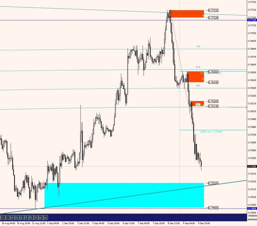
Example 1: Supply Zone Analysis NZD/USD 1 Hour Chart
Hi,
I have been Reading you for a short time.
During this short time, you have shown me a logic way to see supply and demand, more than saying that in that zone are the pending orders of the market makers and leave a pending order to trade it.
Thank you very much for all this information.
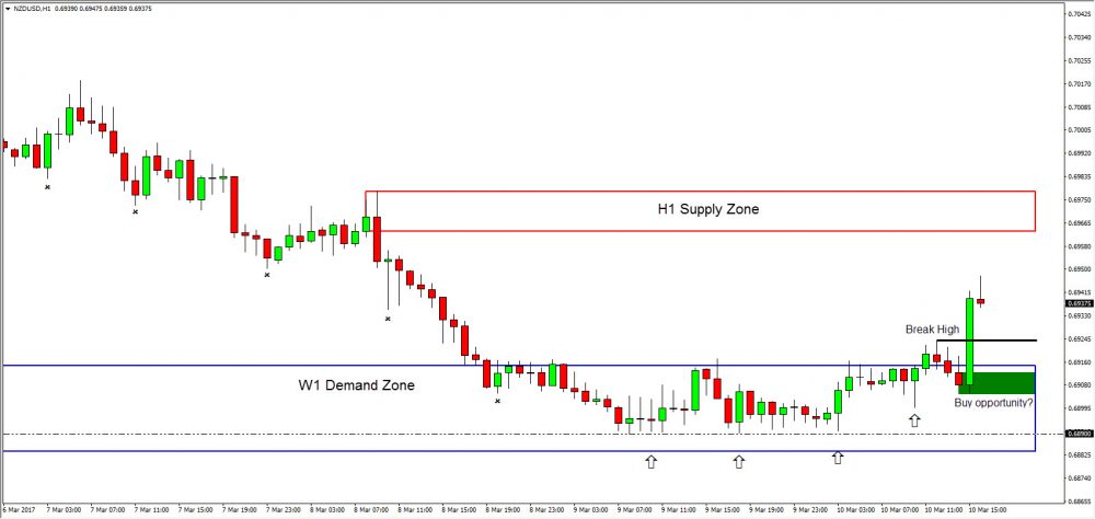
Trying to apply all the excellent information that you have in your page, and missing your posts this week (I hope you are having some nice vacations), I have seen this setup in NZDUSD, well I think it´s a setup like the ones you have shown us.
I would like to know your comments.
The price arrive to a W1 Demand zone, and the lows have been very close to each other (the big players buying around 0.6890?). With the NFP the price break the high that I mark in the chart. With this break of the high, would you say is the confirmation of the big players buying NZDUSD, and the green rectangle would be a nice demand zone to enter the market?
With the TP in the H1 supply zone?
If it is, would you place your SL under the green demand zone or the W1 zone?
I hope you are having an excellent time.
I look forward to hearing from you,
Response:
From the image you’ve attached – I can say you’re on the right track!
However, one small issue…
Judging by the small sized up-swings we’ve been seeing, a significant reversal from this daily demand zone appears a little far-fetched.
Let’s take a closer look.
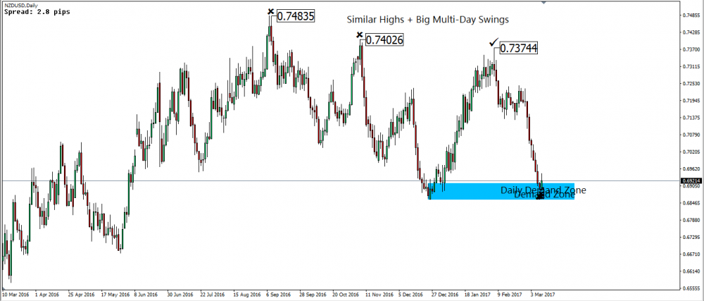
This image captures the reversal on the daily chart.
What stands out here?
The swing highs all form at similar price points, indicating a the likely presence of bank traders’ sell trades. Add to that the significant sizes of these swings—it’s a tell-tale sign of a flood of buy orders hitting the market when banks initiated their sell trades.
Here’s the rule of thumb: the greater the buy orders, the larger the sell trades banks can make, and subsequently, the bigger the market reversal you’ll witness.
If we were to anticipate a large reversal from the daily demand zone, we’d need to see some beefy swings. Why?
Because banks would need a substantial volume of sell orders to place their buy trades.
But so far, we’ve only seen small up-swings, implying a lack of sell orders for banks to leverage and instigate a market reversal.
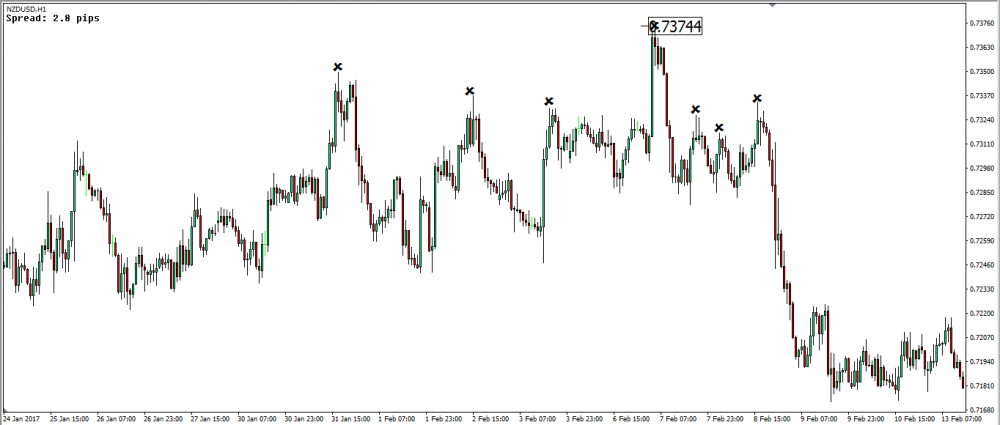
This image focuses on the swing high, marked with a tick on the daily chart in the previous image. Take a look at the swings forming this high—they’re much larger than those we’ve observed within the daily demand zone.
If we’re forecasting a large reversal from this demand zone, the swing sizes need to either match or surpass the ones you see here.
Now, here’s my two cents on the market.
Given the substantial reversal post multiple swing highs congregating at similar price points on the daily chart, I’m leaning towards the market breaking through this daily demand zone.
The confluence of similar price points and substantial swings strongly hints at banks having large sell trades placed, eyeing a prolonged market dip. Of course, expect intermittent retracements and consolidations—the banks’ create these to throw traders off and reposition into the trend.
Continued:
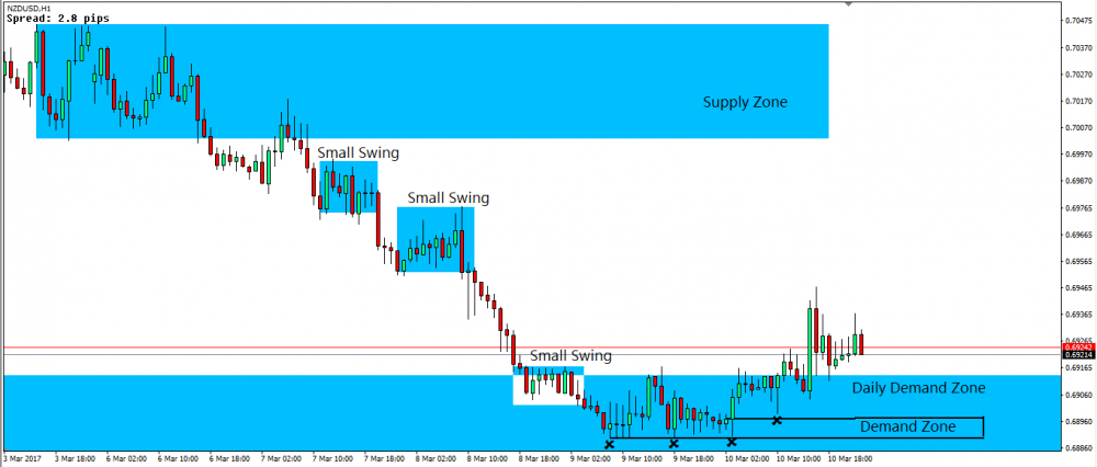
From my read of the current price action, I’m expecting a possible retracement back up to the supply zone this week.
Why this zone, you ask?
It’s sits on the freshest points where the banks likely entered their sell trades. The clue? The swing highs creating the zone all forming around similar price points, with some swings showing some serious size compared to more recent ones.
(Check out those blue boxes!)
Here’s my two cents:
We might see a decline to the lows before the retracement kicks in. So, keep your eyes on the demand zone I’ve drawn within the daily demand zone. This demand is probably where any potential drop will stop and turn into a retracement.
If you manage enter here, place your stop around the 0.68850 level.
We might see a stop run through the current lows before the retracement begins.
Example 2: Demand Zone Aud/Usd 1 Hour Chart
How are you?
I was looking at the charts, scanning them for possible opportunities for the next week and noticed something regarding AUDUSD.
After I made my analysis I’ve read your last blog entry regarding this pair and everything you said matches my view, except that I would look for a short opportunity in a different place (based on what I learned from you and on my own ideas).
So here it is what I see:
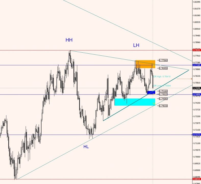
On the weekly chart we have a nice bearish pin bar, touching a descendant TL you can draw through the highs of 2013.04.07 and 2014.08.31 (of course we don’t trade TLs but many people do, so I started watching to possible setups at those areas). Also on the weekly chart we had a higher high, a higher low, but this was followed by a lower high.
I attached a picture with the daily chart, I drawn also some trend lines there. The most interesting is the thicker one. It has 3 touches so I think many people are aware of it.
If the price will reach this trend line soon it will be right into the demand area you also have on your daily charts.
Here comes the fruit of my thinking, lol.
You concluded your analysis with ” I think that ultimately this lower demand zone will end up being broken but not before it causes the market to retrace possibly back up to the supply zone marked on the image or maybe to a supply zone that forms as a result of the market falling into the lower demand, we’ll just have to wait and see what happens next week.”
Looking at the H1 chart I see it was a shock reversal.
Not perfect, but much closer to shock reversal than to a consolidation or deep pullback reversal. The supply zone you marked is above the 50% retracement. In your article about the 3 types of trend reversal you say that in a shock reversal the market won’t break the 50% retracement.
As I see the chart, is very possible we will see a reaction from the lower TL (well, in fact it will be from the demand zone, but not many traders will know it, they will think is from the TL so they will start buying). The suckers selling because they have seen the price was falling on Friday will panic and close their trades, other reactive traders will buy because they see the price going up, etc, you know this better than me.
So perfect conditions for the sharks to add to their positions, and perfect conditions for us to act like remora, hahaha.
But wouldn’t be better to start looking for shorts at the area at 0.7615? Is not a very good supply zone, but is below 50% retracement and there was good selling there also.
Short version: I’m glad my analysis is pretty close to yours but I would look for shorts earlier. I’ve setup an alarm on MT4 to send me an email when price reaches 0.7612 and I will look what happens there.
Of course anything can happen, and knowing how busy you are is very likely that the market will provide an answer before you will have time to read this email, lol. But since you’re my mentor, it was a good opportunity to pick your brains a bit more (hey, you had a 3 weeks break from me, lol).
Response:
Hey there,
AUD/USD is a bit tricky right now.
Based on today’s events, I’m in-line with your analysis.
Still, I’d also be watching for short entries within the zone highlighted in the image.
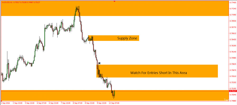
Noticed how the price action changed before and after that X-marked candle formed? Post-candle, buying activity increased, contrasting the prior bearish large range candles that formed. I think this shift shows retail traders who, prompted by the size of the drop, have finally gained enough confidence to jump into short trades.
Remember: Retail traders need to see a price fall for a while before they become convinced a “true” downmove exists and enter in the same direction.
Banks understand this dynamic.
They know taking some profits off their sell trades will send prices higher.
This uptick would then force those late retail short sellers to cut their losses, inadvertently turning them into buyers and propelling the price even higher. The upward movement might then trick some traders into predicting a reversal, triggering their buy orders.
Take together, the flurry of buying will offer the banks a prime opportunity to place more sell trades.
Why am I betting on the banks entering in the marked area?
It’s simple.
This region is where retail traders initially dived into short positions. Before the banks can place their sell trades, most of these retail traders would need to close out their losing short positions.
Here are the potential scenarios I see:
The market could either rise from the current zone into the marked area, or it might break below the zone before rising back into that region.
There’s a slim chance we could see the market rise all the way up to this drop’s high and enter a consolidation phase, but given the drop’s size and magnitude, I’m not holding my breath.
A quick heads-up: a bullish engulfing candle has recently emerged in the zone, which might signal a market move into the marked area within the next few hours.
But, as always, our best play right now is to stay on standby.
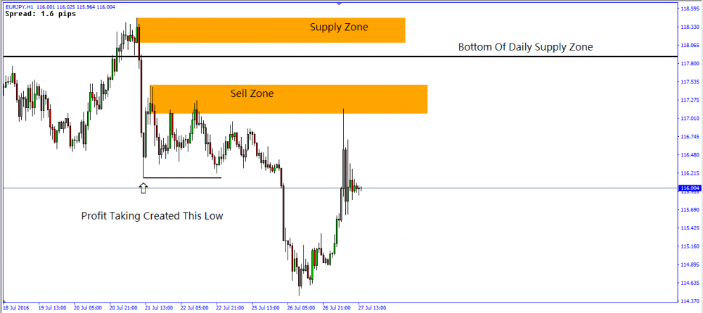
Example 3: Supply Zone Eur/Jpy 1 Hour Chart
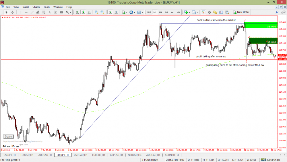
i have made some analysis as part of my practicals.
any thoughts?
thanks in advance.
Response:
Your analysis and mine seem to be the same, even though I usually steer clear of EUR/JPY.
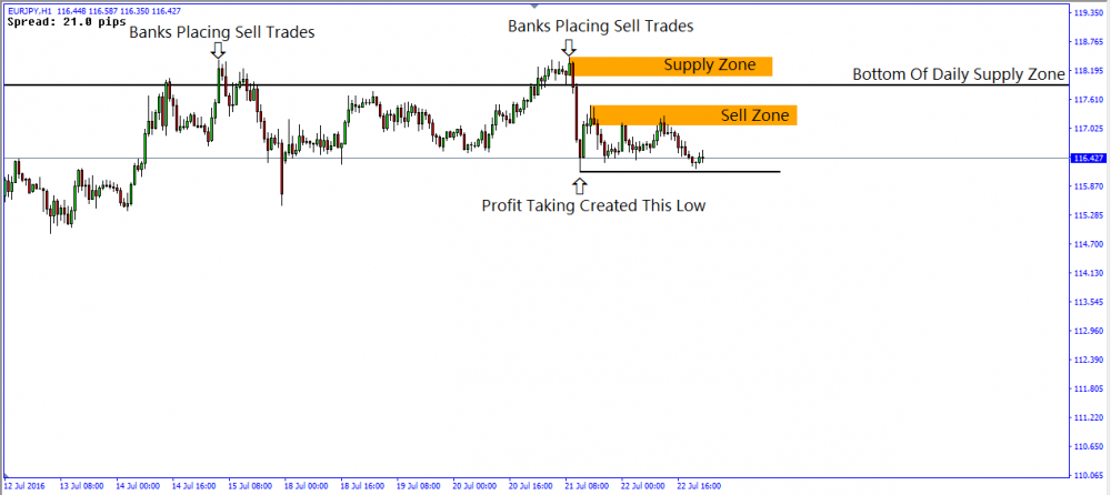
First things first: the market currently sits in a daily supply zone, created from Britain’s brexit announcement. Why is price inside this zone? Well, the banks might be entering more sell trades for the impending downtrend.
If that’s their plan, we won’t see prce breach thezone’s – their sell trades would go underwater.
Looking back, the market inside this supply zone has experienced a double dip. Both these declines probably stemmed from bank traders deploying sell trades, though we can’t say for sure just yet – we need to see how the price action plays out.
Keep your eyes peeled for sell trades at two key points: the supply zone ontop the second dip and the sell zone above the current market price.
The latter is a hotbed for bank sell trades – note the uncanny proximity of the swing highs.
If the market bounces back to these points, the banks will likely sell again, defending their sell positions.
Now, if the market defies these highs and moves towards the supply zone, it reveals the banks probably haven’t entered sell trades at the high points. This suggests that the sideways price action was simply intra-day bank traders clocking in and out of trades.
Our next checkpoint is the supply zone, created by the sharp reversal.
If the market breaks this zone, it signals the double dip didn’t result from bank sell trades.
Instead, it indicates the market may continue rising before reversing again, or even keep climbing indefinitely – in which case, time to hunt for long trades.
Continued:
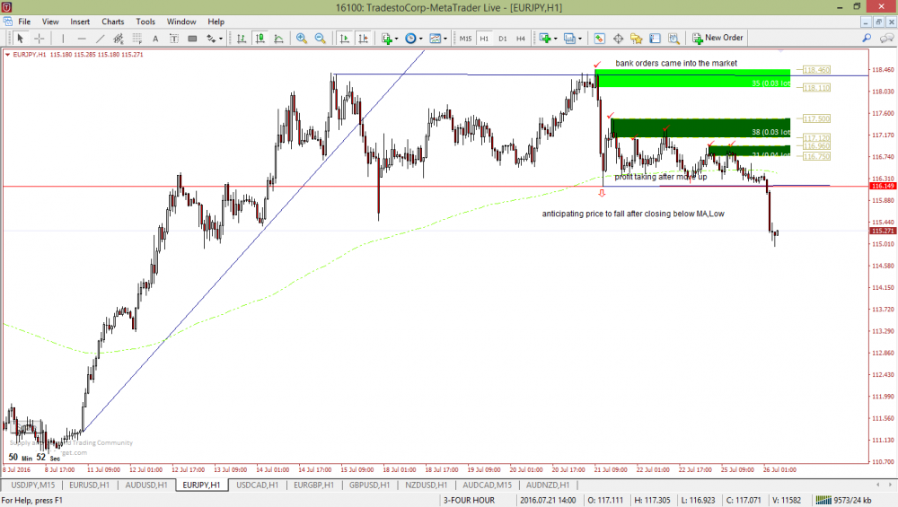
A follow up on this pair: price has broken 115.23 low. so it proves that banks were indeed placing multiple orders? Also, price have moved from imbalance phase to a liquidation phase, or this current move is still regarded as imbalance phase?
I also notice that USDJPY is doing the same.your thoughts?
Response:
We’re seeing some crazy price action with a significant upswing unfolding. This rally has pushed the market back into the sell zone mentioned Monday’s email.
The market’s response suggests the banks may have entered more sell trades. However, we can’t confirm this just yet – we have a high-impact USD news release looming in the next hour, and the FOMC announcement scheduled for later tonight.
Here’s my two cents: sit tight and wait for these news events to come out before trying to go short. Keep in mind, the FOMC announcement can trigger wild price swings. The dust only settles a couple of hours post-news.
So, jumping in now might be risky.
Example 4: Usd/Cad 1 Hour Supply Zone
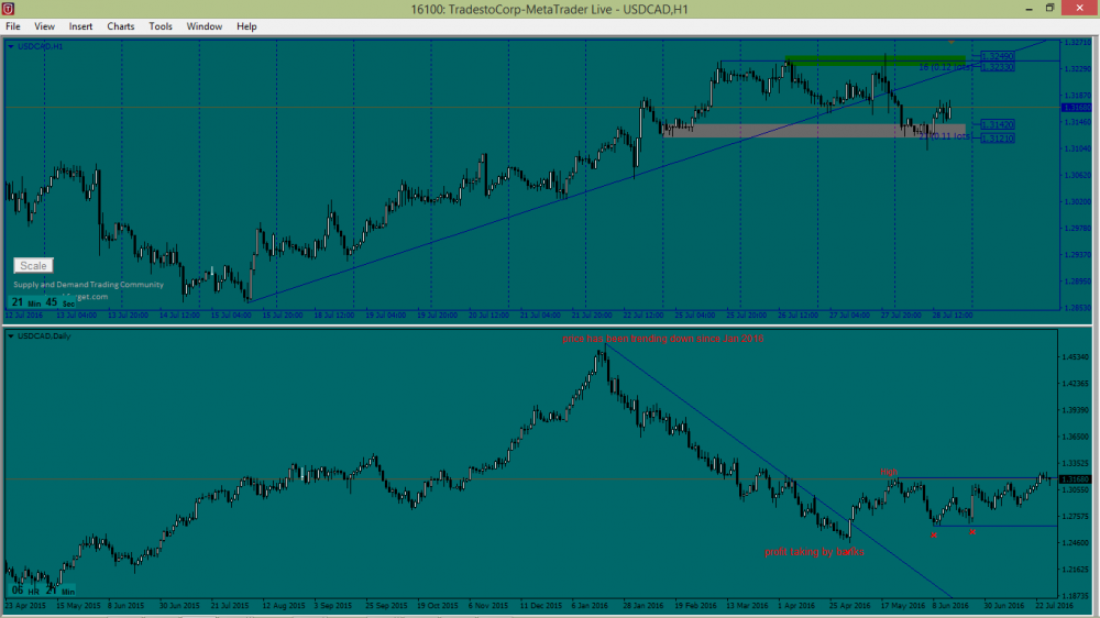
I attached USDCAD analysis on the daily and 1H, i marked areas on the daily where i think bank traders got involved.
Currently daily seems to be consolidating after down trend.
Response:
USD/CAD is a bit of a head-scratcher right now. The market appears to be in a holding pattern. That downtrend was stalled when, as you noted, the banks began taking profits off their sell trades.
Now, we’re playing the guessing game: which direction will the market break?
The daily chart shows many swing lows—either resulting from bank traders placing buy trades or pocketing profits from sell trades. If the market falls below these swings, we can surmise these weren’t caused by banks placing buy trades.
Why?
Simple: Because banks wouldn’t let price drop far beyond their entry point, as they would lose money.
On the flip side, we’re seeing swing highs form due to selling pressure. The question is whether this selling is from banks taking profits off buy trades placed at swing lows or from them placing sell trades in anticipation of the downtrend regaining momentum.
And there lies the complexity of consolidation.
Both theories seem plausible—banks could be readying sell trades for a downtrend or setting up buy trades in anticipation of an upward move.
Be it a complete trend reversal or a significant pullback, it’s tough to call.
Our strategy?
Keep an eye on those swing lows and highs.
Looking at today’s candle, the market has taken a significant dip, keeping the sell-trade theory alive since all highs have occurred at similar price levels.
The spotlight now shifts to the two recent adjacent swing lows.
We understand these lows formed from banks placing buy trades or taking profits off sell positions. If the market dips to these lows and bounces back, it suggests these lows could still be triggered by banks securing profits or executing buy trades.
If price plummets below the lows by roughly 100 pips, it indicates that profit-taking, not banks making the market reverse, formed these lows—because banks would avoid letting the market sink far below their entry point.
For the one-hour chart, I suggest focusing on short trades until the market meets those swing lows we just discussed.
Once there, let the price action guide you on whether to go long or short.

Grab Your FREE E-Book:
5 Pro Rules For Trading Supply And Demand
- Master the core principles of supply & demand.
- Advanced techniques for trading SD zones.
- Exclusive new lessons/books/tools every week!
Sign Up Now To Download Your FREE Guide:
🛡️ Spam-Free Promise: No spam, ever. We'll only send you relevant updates and content. Unsubscribe at any time.