
The Commitments of Traders (COT) graph is an invaluable tool which offers an assortment of trading insights and possibilities.
From identifying ongoing trends, anticipating potential reversals, to finding powerful technical points, the COT graph is not just an essential tool; it’s a helpful trading companion which allows you to make informed decisions with confidence.
In my years using the COT tool, I’ve identified three practical ways to harness it’s power when analyzing and trading the markets.
Want to learn more?
Read on…
#1: Identifying The Trend
Trends form because of the banks and other large institutions buying and selling over time.
With a tool like the Commitment of Traders (COT) report, we can monitor this trading activity. We can identify whether it’s on the rise or decline and promptly discern the current trend, not to mention gauge its momentum.
Now, imagine this scenario…
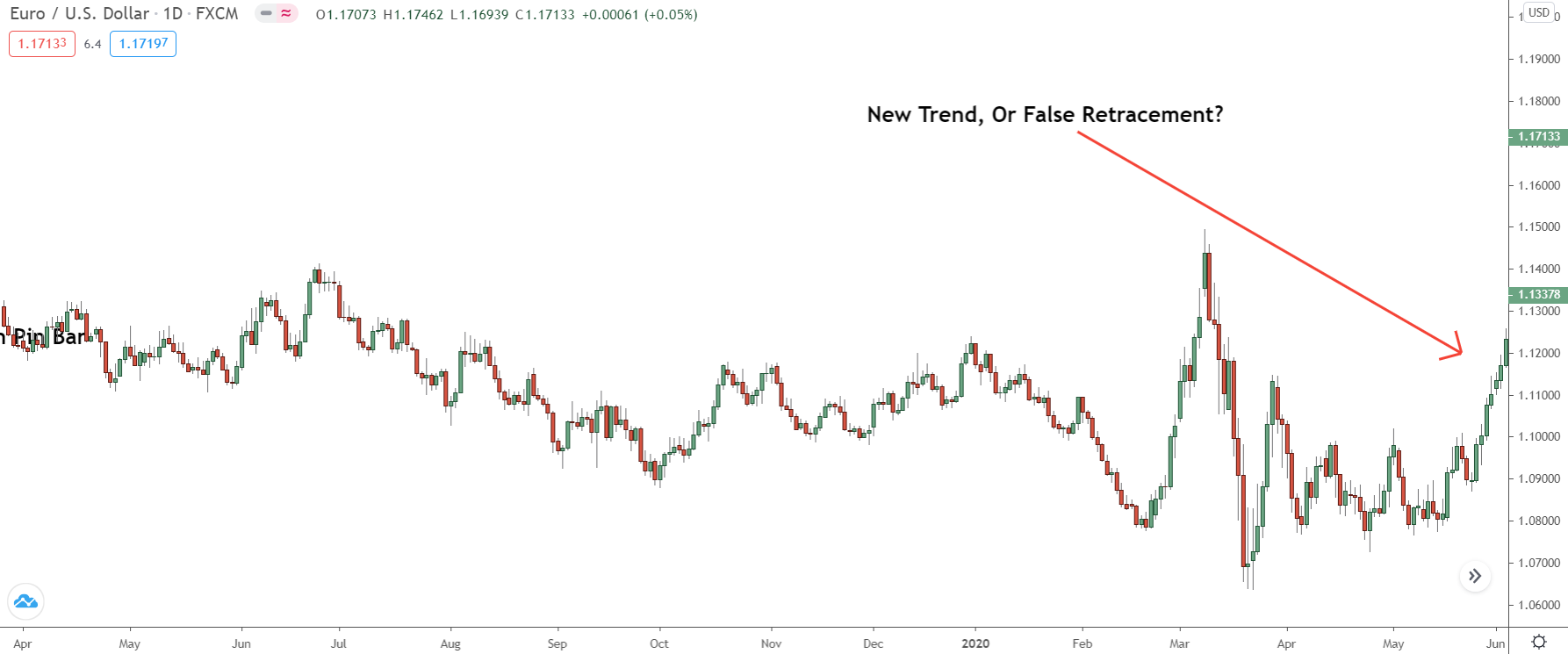
Price is rising, but how do we determine whether this is a new trend or just a retracement?
The answer shows on the COT graph…
Assuming this movement is indeed “authentic”, we should spot a steady rise in the number of net long positions… This shows the banks are executing more buy trades as price rises – a strong indicator they anticipate a new uptrend beginning.
Shifting over to the graph, it becomes clear… the banks are buying more during this upswing.
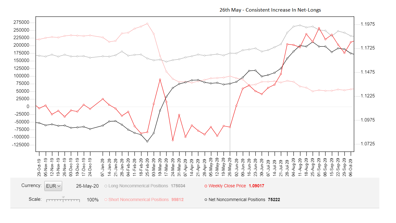
Since the reversal, the Commitment of Traders (COT) report has been released five times. Each release has revealed a consistent uptick in the number of net long positions (buy trades) placed in the market.
Simultaneously, there’s been a decrease in net shorts.
Taken together, this indicates a new uptrend trend or significant upswing, is beginning. Price is likely to continue higher over the ensuing weeks, which it then does.
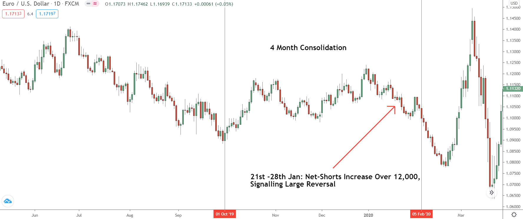
You can use the graph to pinpoint consolidations too…
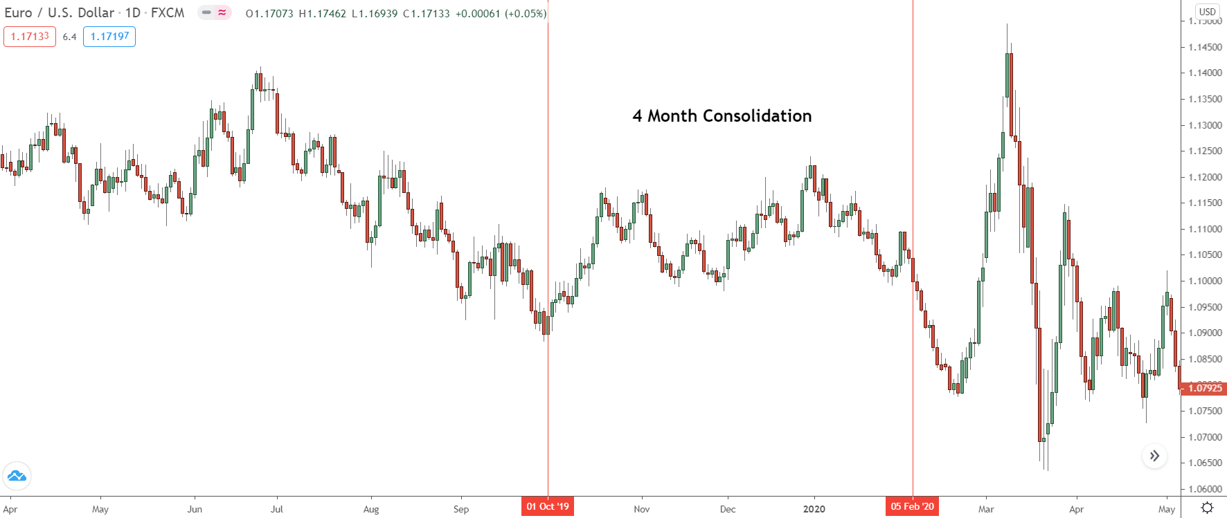
Between October 2019 and January 2020, EUR/USD moved sideways… there was no trend.
With the benefit of hindsight, that’s obvious!
However, during that period, it wasn’t immediately clear when this consolidation began or how long it had been unfolding. Yet, if we take a step back and review the COT graph, we can identify the early signs of consolidation as far back as September…
A full month before the actual consolidation set in!
Don’t believe me?
See for yourself…
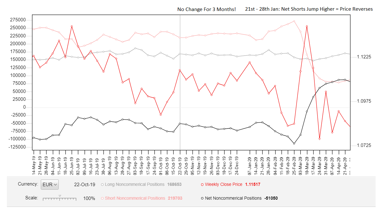
On the COT graph, there was virtually no change in the net-short and net-long trades for a solid three months!
Here’s the kicker: Every rise in net-short or net-long trades was counterbalanced by a similar decrease shortly thereafter… leading to both lines remaining flat for nearly three months!
If that doesn’t scream consolidation, I’m not sure what does.
So, what unfolded when there was a notable increase in short trades on February 27th?
A colossal down-move ensued…
Just another fantastic method of using the COT graph in your trading.
Key Point: While a significant increase in open trades often signals a trend, at times, it might indicate just the opposite. For example – you see a substantial increase after a long trend – similar to the current situation on Eur/Usd (as of 09/10/20).
This could suggest a ‘blow-off top’, making a deep retracement or even a reversal likely.
#2: Anticipate Major Reversals
The ultimate goal for every forex trader is to catch large reversals BEFORE they begin.
And guess what – The COT report can help with that too.
The key to predicting reversals with the COT involves watching for extreme readings.
Scan for the number of net shorts or longs reaching extreme levels. More specifically, look for this after price has been trending in the same direction for some time without any recent deep retracements or long, drawn-out consolidations.
Together, these are excellent indicators a reversal might be on the horizon.
Here’s an example for better understanding…

Remember this reversal on Eur/Usd?
Before price reversed, the market seemed overwhelmingly bullish… so much so it looked like a fresh upswing or uptrend was beginning. However, a mere couple of months later, price reversed, giving way to a new downtrend.
Traditional TA methods would likely have left you blindsided.
But, if you take a peek at the COT graph, the clues were all there.
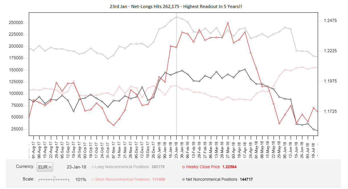
For six consecutive weeks, the net-long number was hitting new peaks each week – see that? By Jan 23, the net-long tally skyrocketed to 245,000.
It’s highest reading in OVER 5 YEARS!!
With long positions soaring to such extremes, price expectations were understandably riding high – after all, why else would there be such a bullish sentiment?
But check out the net open short trades…
After a period of decline from January to April, it had started inching higher for three successive weeks. That’s a clear sign traders were starting to enter more and more short positions.
It begs the question: who buys when everyone is bullish, and price is trending higher?
So, when you connect the dots, the signs are fairly disconcerting…
There’s a long uptrend with no recent deep retracements or major consolidations – which, as I detail in my books, is necessary for trends to continue. The number of open long trades has hit a 5-year peak; it seems like everyone and their dog is bullish now.
The icing on the cake: the number of net shorts is rising.
Again, who sells when everyone else is buying?
However, that alone doesn’t mean a reversal is beginning – we need concrete price action as evidence, such as a steep decline or a couple of large bearish engulfing patterns.
And, as it turns out, that’s precisely what happens…
We get two steep declines, with the second making a new lower low.
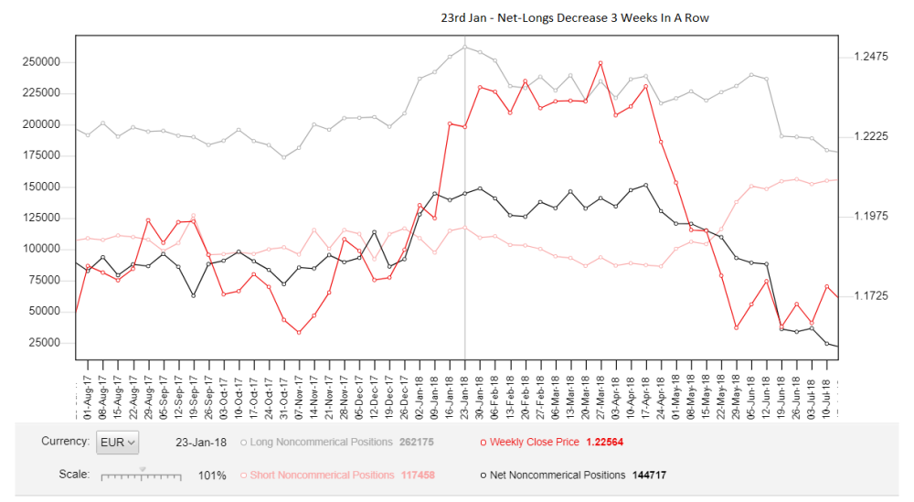
The graph reveals a three-week declining trend in the number of open long trades.
Why would banks be closing their long positions and ramping up their shorts when the market sentiment is so bullish, and everyone seems to be buying?
…Maybe because they know something we don’t?
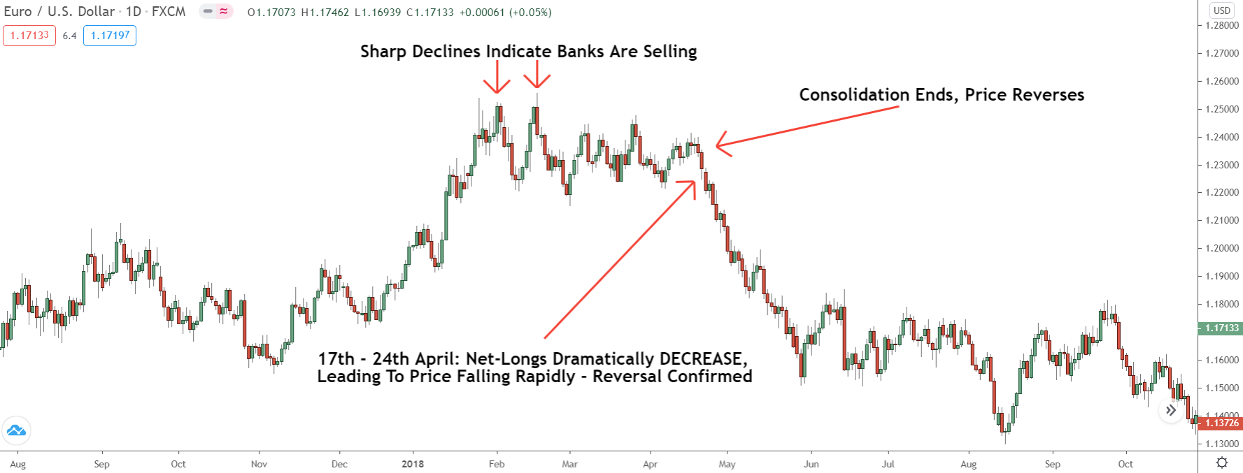
The confluence of these indicators suggests a high likelihood of a price dip—either due to a significant retracement or a trend reversal. In our case, it’s the latter: after a three-month consolidation, price reverses, and a fresh downtrend begins.
Our cue came from the Commitments of Traders (COT) graph.
Between the 17th and 24th of April, the graph recorded a substantial dip in the number of net longs. This brings us back to the question:
Why are banks closing their long trades?
This was succeeded by a significant surge in net shorts in the next week, indicating banks were starting to open sizeable short positions.
Here’s a suggestion: Take some time to check the graph yourself.
Look back and understand what the COT graph was displaying—how the net longs/shorts transformed before previous reversals occurred.
More often than not, you’ll discover the graph hinted at an impending reversal via shifts in the net longs/shorts. Identify these shifts, and you’ll be able to anticipate many reversals before they begin, giving you a head start on the rest of the market.
#3: Finding Strong Supply And Demand Zones
Detecting potent supply and demand zones can often be quite a challenge.
However, the COT graph can make this task much easier.
With the aid of the graph, you can quickly determine whether a zone holds strength or not by seeing whether it aligns with a large increase in open long or short trades.
Here’s the breakdown of how this works…
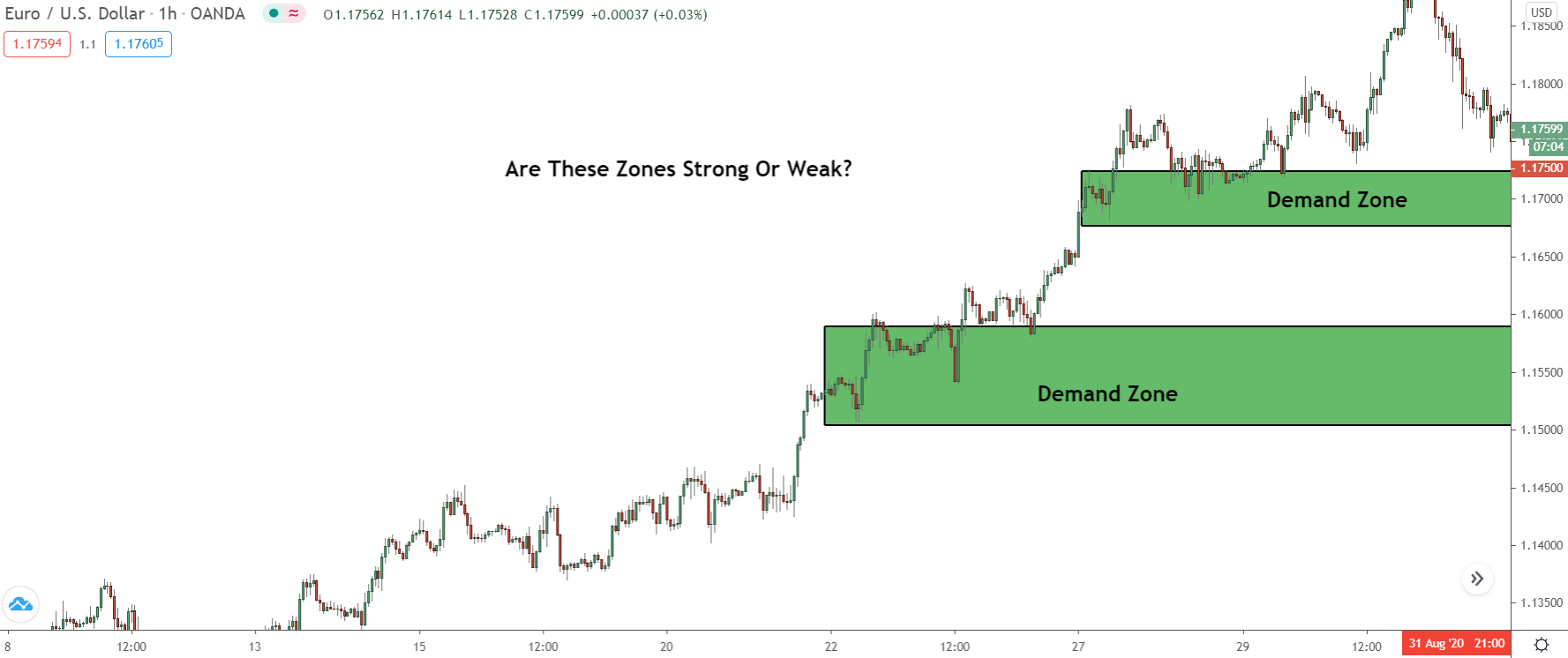
Suppose you’re curious about the power of the demand zones above.
Here’s what you’d do: Head over to the COT graph and check if there was a significant rise in open LONG trades (net long, on the graph) during the period the zones formed.
If there was… well, the zone probably packs quite a punch.
Why?
Banks can ONLY buy when other traders are selling.
So, when this increase happened, the banks could only place their buy orders while price was falling. Looking at the chart, the only time price actually declined during this rise—apart from the tiny swings at the bottom—was when the two demand zones was forming.
Therefore, that’s likely where they initiated most of these new sell trades.
Switching gears to the graph…
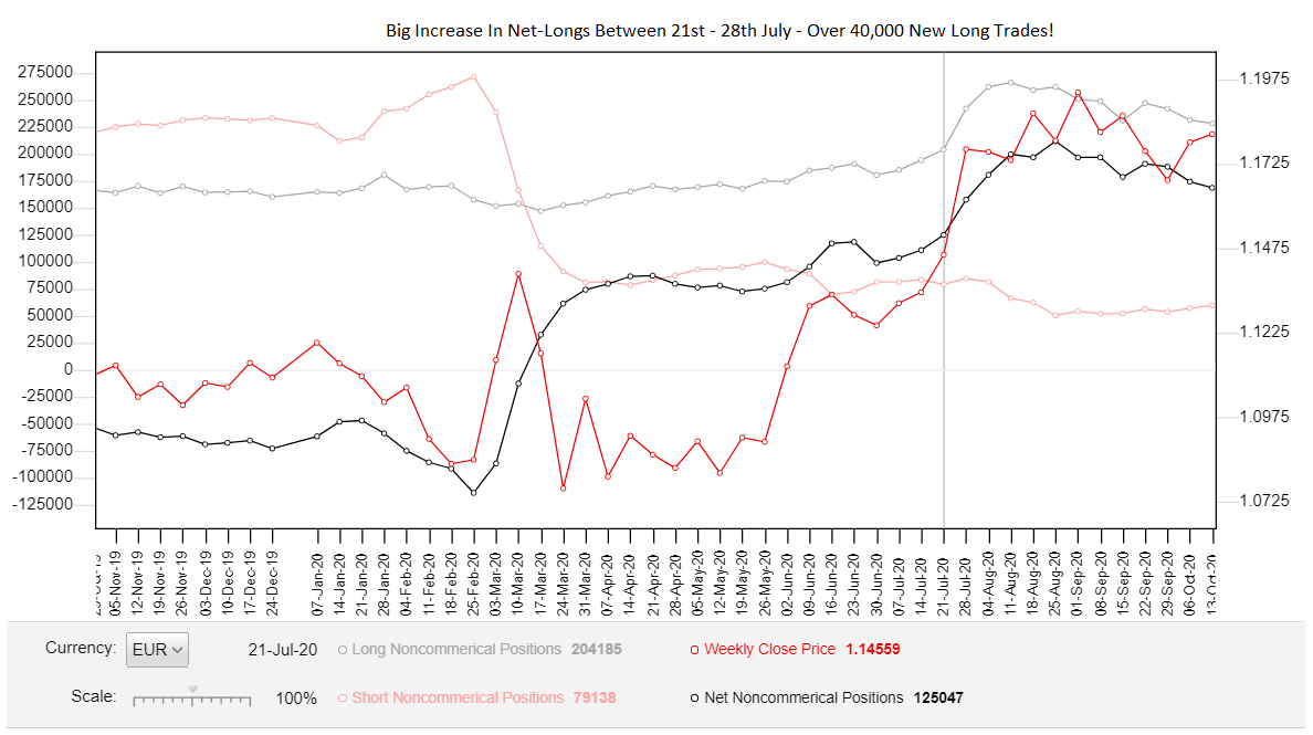
You’ll see a notable uptick in the number of open long trades (the light grey line) between the 21st and 28th of January, from 215,000 to a whopping 239,000—an impressive leap!
So, if price revisits this zone in the near future, we know it has a high probability of triggering a reversal. Why? Because the banks have placed a significant number of long trades at the point of its formation.
And would you look at that…
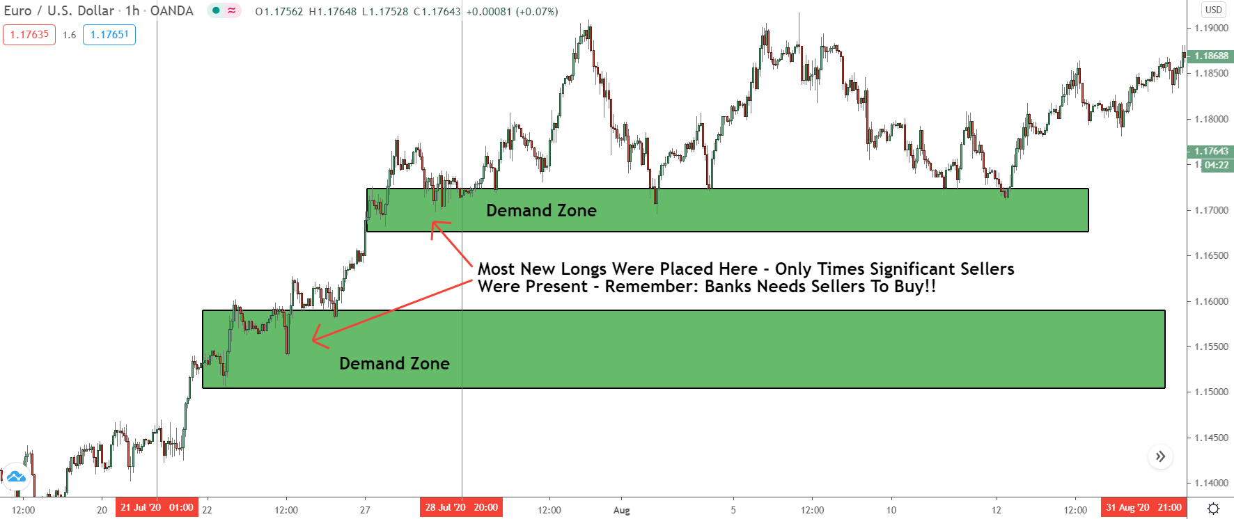
Once price returned to the zone… boom!
It reversed, sparking off another significant down-move.
That’s the power of using the COT to find good zones!
Being a Drop-Base-Drop zone meant we probably wouldn’t have even considered this for trading. Looking at the COT, however, reveals the banks placed a significant number of short trades to create zone, making it extremely powerful, and giving price a high probability of reversing once it returns.
And there you have it: how to use the COT to find powerful zones!
Check my VIP membership for more premium trading guides.
Very insightful! This is great info. Thanks