
How many times after drawing a supply or demand zone have you seen price return but then reverse just before entering and giving a signal to place a trade?
Trust me, I’ve been there.
More times than I can count.
Many traders shrug this off, attributing it to sheer luck or some mysterious market whim. But h while occasionally it might be random, more often than not, it’s a direct result of a tiny oversight they made while marking out the zone.
So today, I’m going to clear up what that mistake is and teach you how to properly draw these zones.
This way, you won’t miss any future opportunities to make trades.
Are You Making This Mistake?
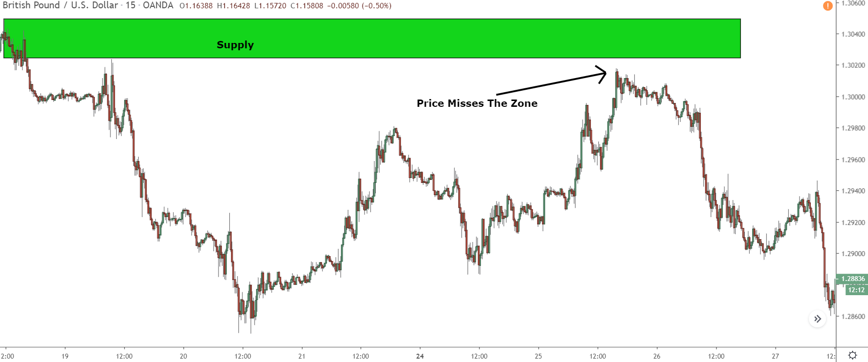
Take a look at the zone below and tell me if you think there’s anything wrong with the way it’s drawn.
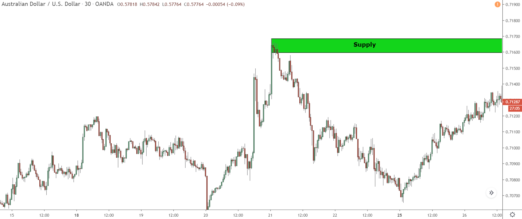
Looks fine, doesn’t it?
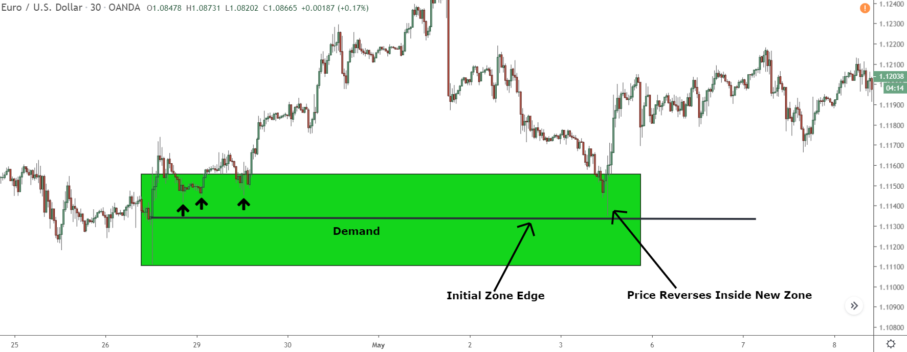
It’s drawn from the close of the last small candle before the decline, the top of the zone sits on the most recent swing high, and the decline itself was pretty steep, which is how you’re supposed to draw the zones.
Let’s see what happens when price returns…
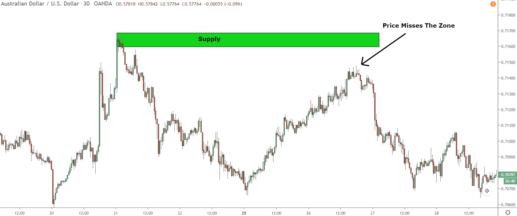
Ahh, it’s that dreaded situation, isn’t it?
Price comes back to the zone but then reverses just before hitting the edge, providing you with no entry and causing you to miss out on a good trade.
Seen this before?
You might think it’s all down to luck, or there’s some mysterious reason why the price reversed that we just don’t know.
Sometimes that’s true.
But, in this case, that’s not it…
The real reason the price didn’t reach this zone before it switched direction: the zone wasn’t drawn to include all the points where banks entered trades and caused price to reverse.
Confused?
Let me break it down…
If you’ve read my posts about supply and demand zones, you know these zones are created because of the trades the banks make. When they enter their trades (or take profits in some cases), it causes a rise or decline, and as a result, a supply or demand zone forms.
Price then returns and reverses at the zone because the banks haven’t been able to enter all their trades due to a lack of available buy or sell orders – something I’ve covered in my books.
So, how do we draw supply and demand zones?
We start at the last small candle before the steep rise/drop, and drag up to the most recent swing high or low, right?
We find the last small candle which formed before the steep rise/drop started, and then we draw a zone from there to the most recent swing low or high. We draw the zones from here because these points, specifically the high or low, are where the banks entered trades to make reverse and form the zone.
If the banks haven’t managed to place all of their trades – which they haven’t, hence why price returns – this zone is the most likely area for them to enter the next batch to cause a reversal.
If you’ve read my books, you probably already know what I just explained.
But here’s the secret:
The banks don’t always create a zone by just placing one bunch of trades.
Often, they’ll place one bunch – causing a high/low to form – then, maybe after a short rise or drop, they’ll place another two or three bunches nearby, creating a couple more highs or lows before the main rise or drop happens and forms the zone.
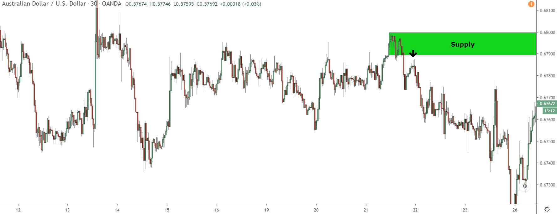
You can see this in the zone below…
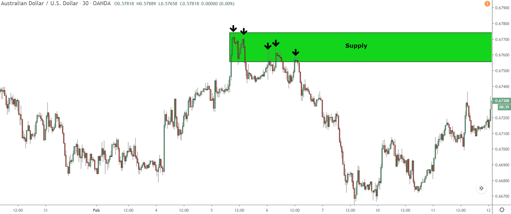
This supply zone formed because the banks entered five sets of sell trades.
The first and second sets put a stop to the upswing and started the initial decline. The third and fourth sets were placed to end a small comeback a few days later. Lastly, the fifth set ignited the main drop that caused price to reverse and the zone to form.
Now, here’s where you and many other traders tend to slip up with zones like this – you forget the banks have placed multiple trades.
This mistake often leads to incorrect zone drawing.
For instance:
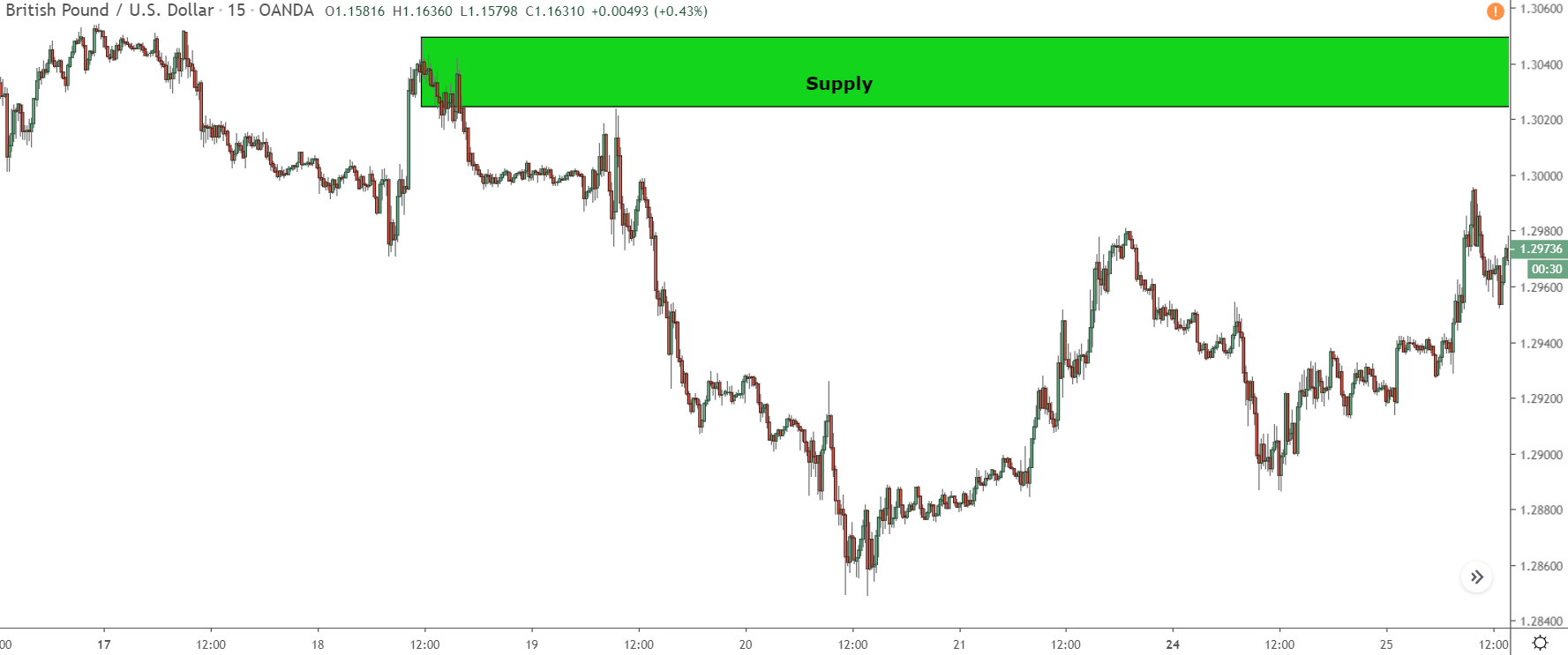
Many of you might draw the zone as I have, from the starting point of the initial decline up to the most recent swing high.
That’s what most books, experts, and so on advise you to do when drawing the zones.
But, let’s see what happens when price returns…
It reverses just before entering the zone, causing you to miss out on a successful trade.
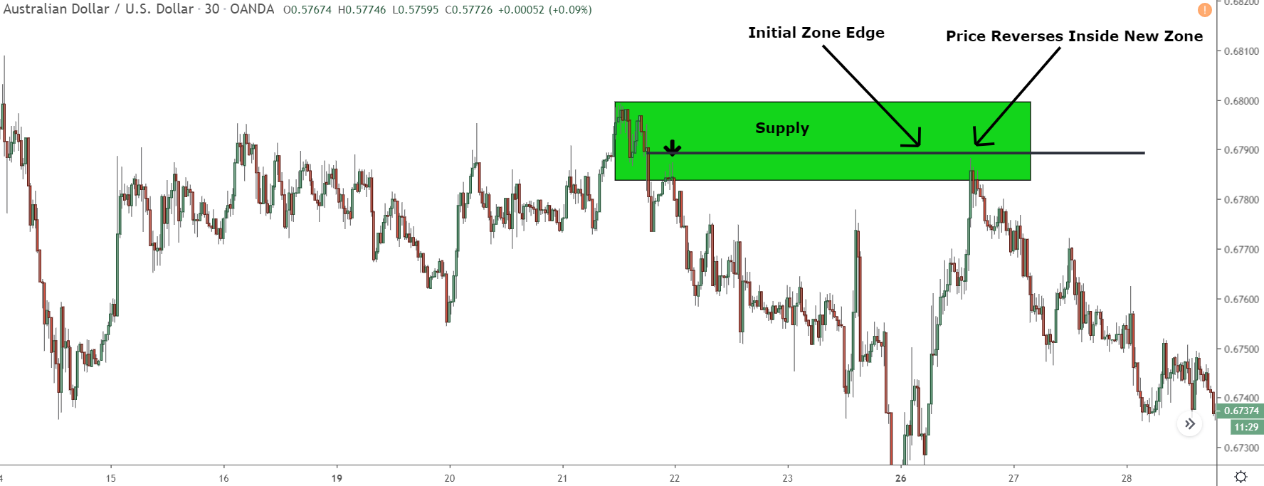
Now this wasn’t just bad luck or one of those random trade that fail. The real reason was you didn’t include all the points where the banks placed their trades when drawing your zone.
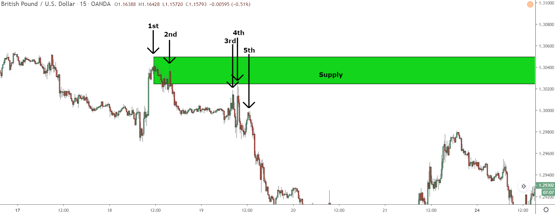
This zone formed from the banks placing 5 sets of trades, each of which caused a small high to form.
When you marked the zone, you only included the two sets that created the initial high, as that was the source of the decline.
You missed out on the other three sets.
These sets were equally important in predicting where price could reverse. So, it might look like price just missed the zone and didn’t give you an entry point.
That’s the common mistake people often make while drawing these zones.
If you draw the zone focusing only on one set of trades and ignore the others, your zone ends up being off. Then, when price returns and doesn’t reverse inside, you might think it’s just an unlucky trade. But in reality, it’s because the zone wasn’t drawn properly.
So, that’s a big “oops” moment people often have while drawing supply and demand zones.
But don’t worry, it’s fixable!
Let’s take a closer look at how to correct it…
How To Draw The Zone To Include Where The Banks Have Placed Trades
To draw a zone that includes the points where the banks entered their trades, you need to highlight the zone around the nearby peaks (highs) or valleys (lows). That’s because these are the spots where banks made other trades that caused price to change direction and move away from the zone.
If you’ve read my books, you might already know how to do this.
But if you haven’t, don’t worry!
I’ll guide you through it step by step.
First, mark a zone on the chart, just like you would do in normal trading.
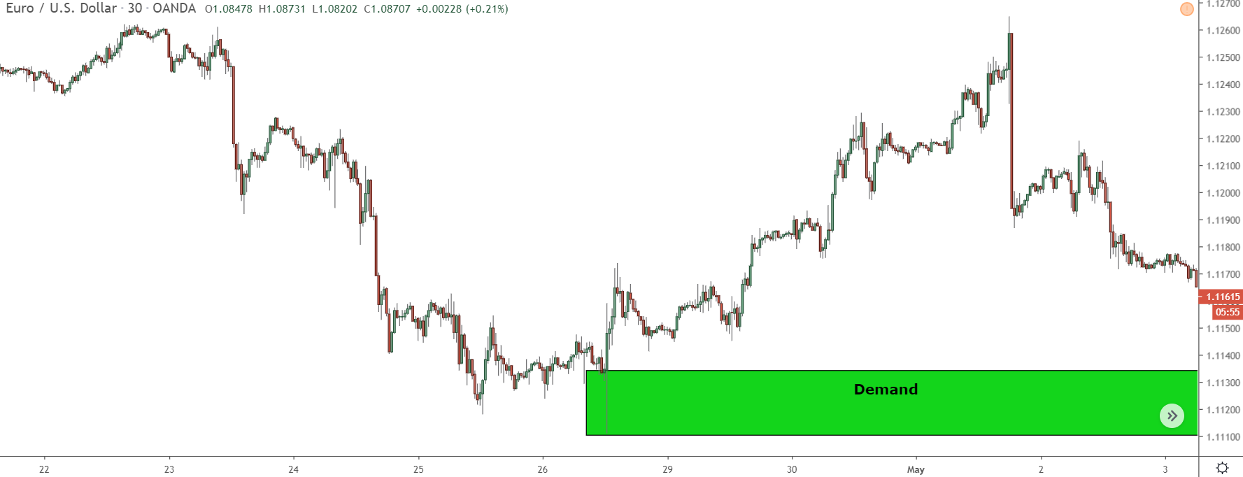
I’ll use this one, as the lows are easy to see.
Next up, check if any recent lows (or highs for supply zones) formed near where you’ve marked the zone.
In this case, a couple of small lows (those black arrows) formed just below the zone.
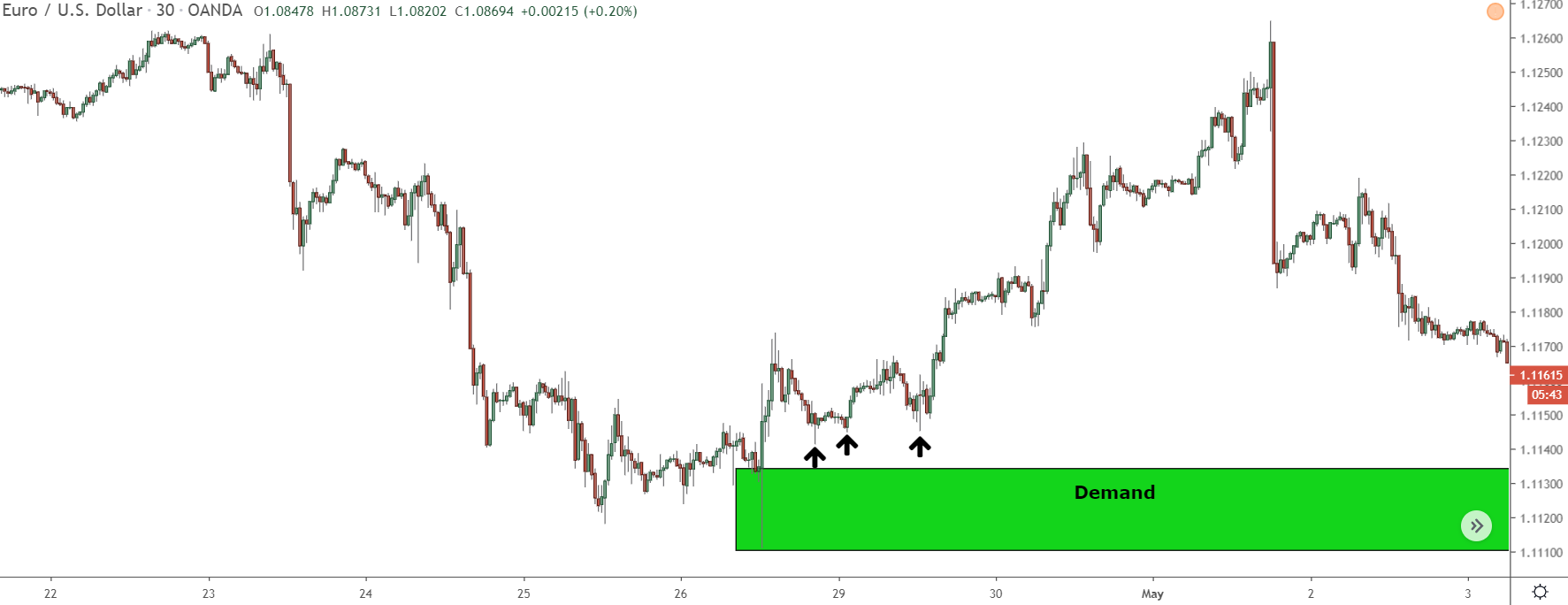
These lows formed because the banks started entering buy trades. So, you’ve got to adjust the zone to include them. Why?
Because prices might reverse around these points when they return.
To include these lows, just stretch your zone to either the opening or closing of the candle which created the most recent low.
If you’ve followed the steps correctly, it should look something like this.
Now, let’s take a look at another example just to make sure you’ve got it…
So, once again, start by marking a zone, just like you normally would.
Next, check if any recent highs or lows have formed near the zone.
Remember, supply zones form when the banks enter sell trades. So, we need to look for recent highs near the zone. That’s where the banks would have placed any extra sell trades to make price fall.
As you can see…
1 little high formed just below this zone, so we need to bring it down to include it within.
Always remember: When you mark the zone, mark it from the open or close of the candle (either is fine) which resulted in the lowest recent high near the zone. This spot is where the banks most likely placed their trades, so it’s crucial our zone covers this point.
Voila!
With that, our zone is all set.
Keep in mind – each zone is unique.
The highs and lows of these two zones won’t look identical for every zone you stumble upon.
But, if you follow these rules and draw the zone to the recent highs or lows hanging around nearby, you’ll nail it most of the time. And even if you’re a bit off with your zone, it’ll still cover more points you might’ve overlooked otherwise, increasing your chances of getting it right.
The Bottom Line
Go back and practice re-drawing some old S & D zones using what I’ve explained above.
Redrawing zones to include recent highs/lows will help you get a better hang of how to draw them accurately.
You’ll also see just how many trades slipped through your fingers because your zones weren’t quite right, and why it’s super important to include points where banks entered additional trades when you’re marking the zone.

Grab Your FREE E-Book:
5 Pro Rules For Trading Supply And Demand
- Master the core principles of supply & demand.
- Advanced techniques for trading SD zones.
- Exclusive new lessons/books/tools every week!
Sign Up Now To Download Your FREE Guide:
🛡️ Spam-Free Promise: No spam, ever. We'll only send you relevant updates and content. Unsubscribe at any time.