
Did you know:
A whole bunch of newbie and seasoned supply and demand traders don’t quite nail it when it comes to drawing their zones the right way.
Yep, that includes some of those so-called gurus and experts too!
It’s crazy, right?
Well, here’s the deal:
If you’re not nailing down those zones the right way and sticking to the rules, there’s just no way you’ll make consistent profits with supply and demand trading.
No kidding, it’s that simple!
That’s where I come in!
In this post: I’ll explain the real way to draw supply and demand zones.
My method draws the zones from two key points: the current high/low and the BO – breakout point. It’s simple, takes minutes to learn, and most importantly: allows you to draw supply and demand zones correctly.
Sound good?
Before we get to that, though, let’s take a quick look at why so many traders draw supply and demand zones incorrectly – and if you need my help.
Cracking the Code: Why So Many Traders Draw Supply And Demand Zones Incorrectly
In the murky world of supply and demand trading (and forex in general, really), gurus and experts rule the roost.
I should know – I’m one of them!
But here’s the thing: A whole bunch of so-called supply and demand “experts” are just spewing nonsense.
It’s a bummer, but it’s true.
These traders pretend they’ve got S&D all figured out, but they’re clueless about how the zones actually work. So, they end up teaching folks to draw zones in the weirdest, most bizarre ways.
Like, seriously…
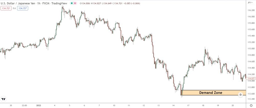
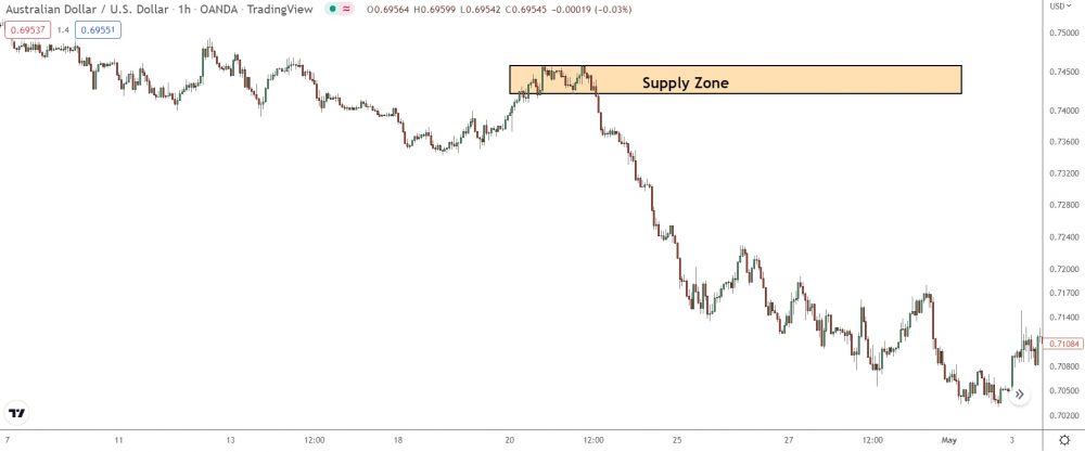
Here’s a supply zone on Eur/Usd – nothing unusual, right? Looks like your typical high quality demand zone: it has a clear base and a steep rise, indicating a strong zone.
All in all, a great zone.
But what happens when price returns…
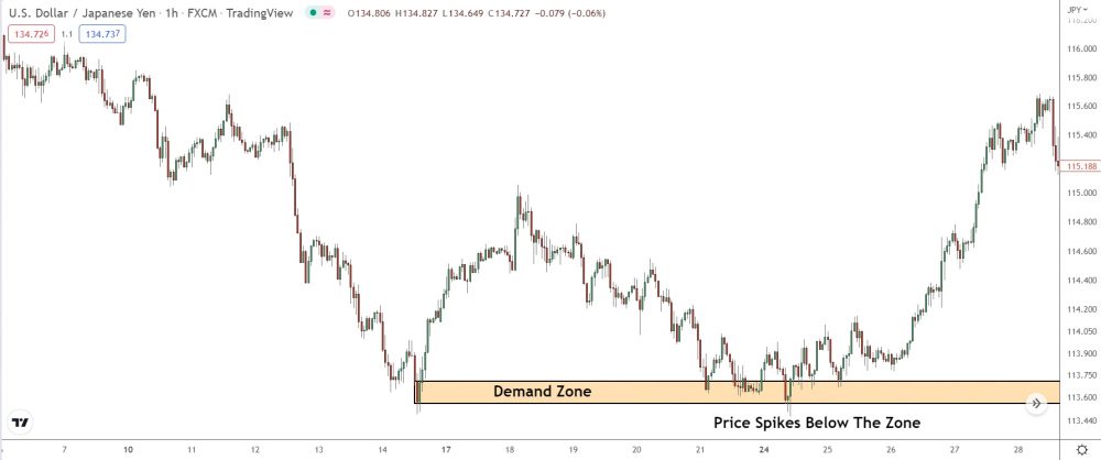
Price spikes through the zone and reverses near the lows.
You might be wondering, why didn’t it reverse inside the zone?
Because… IT WAS WRONG!!
The zone didn’t encompass the correct points: that’s why price spiked the lows before reversing.
For many of you, this could be an eye-opener.
The method above of drawing supply and demand zones is super popular among traders.
But it’s not the right way; not even close!
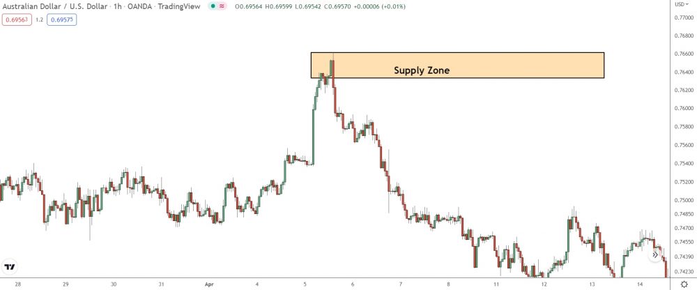
Here’s the right way to draw the zones…
See how I include the base AND the most recent swing high?
That’s the correct way to draw supply and demand zones: from the base – the small consolidation/pause before price moved away – to the most recent major swing high or low.
- For demand zones, draw from the base to the swing high.
- For supply zones, draw from the base to the swing low.
The current major swing high/low marks where the banks and institutions jumped in with their massive positions, causing price to move sharply and forming the zone.
Hence, that’s the key spot to include when drawing the zone.
If the banks want to reverse price, they’ll probably jump in again somewhere between this point and the base when price returns.
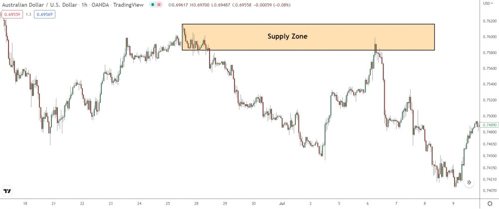
Here’s another one…
Different zone, same process: the zone covers the base AND down to the most recent major swing low.
So, when price returns to this spot, the banks might jump in somewhere around this area. You can’t be sure if they’ll enter near the peak, close to their most significant positions, or somewhere around the base. But, in any case, it doesn’t matter.
Cover both points with the zone, so we know price will reverse inside.
Chart Your Way to Success: A Foolproof Guide to Drawing Supply and Demand Zones
Now I’ve covered the basics, let’s dive into a step-by-step walkthrough on drawing supply and demand zones, starting from the base and working our way to the high/low.
Ready to rock and roll?
Here’s step 1…
Step 1: Identify The Zone Base
Before you even think about drawing a supply and demand zone, first locate the point of origin for steep rise or decline.
Or, in other words: the base.
“The base… what the heck is that?“
In short: the small pause or consolidation that takes place right before price reverses. The base indicates where the banks entered their positions to cause the reversal. Therefore, you must include the area to mark and identify a supply or demand zone.
To find the base, follow these three steps…
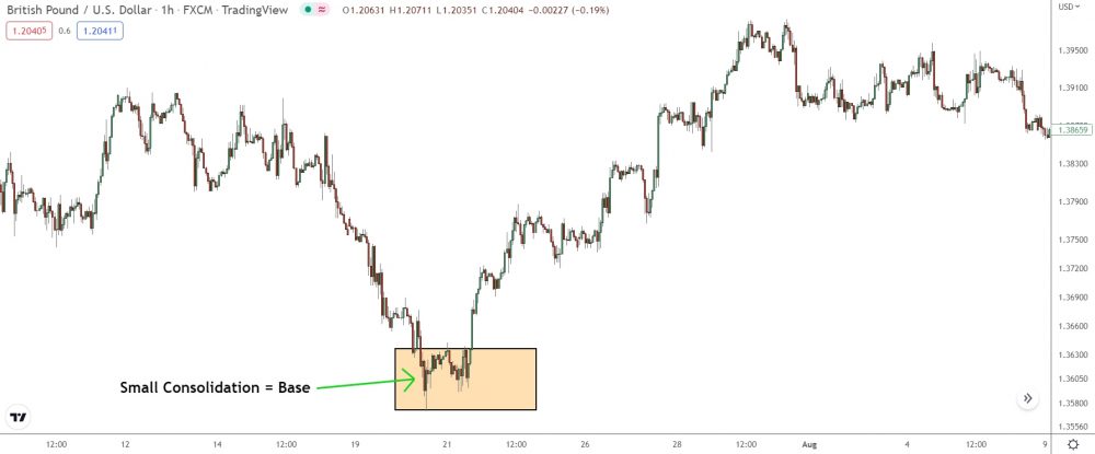
- Spot the huge candlesticks that identifies a zone.
- Find when the first large candle formed.
- Locate any consolidation or pause happening around that area.
Found the consolidation/pause?
Great, that’s the base!
It looks like little block of price action right before price shot off.
The candlesticks should be both bullish and bearish. And they should be way tinier than the candles that make up the move away. Now, the base might just consist of a few candles, but sometimes it’ll be a longer and appear more like a consolidation.
In any case, size doesn’t matter.
A base is a base, no matter the candlesticks.
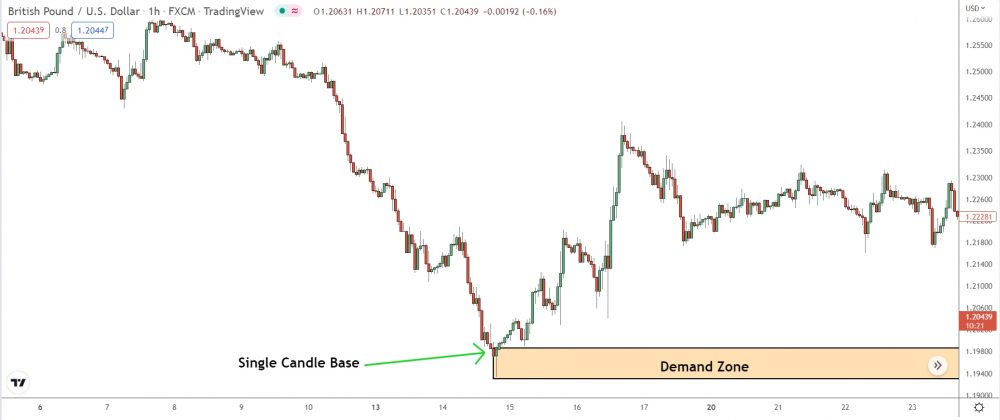
Important: In most cases, the base consists of a few small candlesticks. However, some supply and demand zones develop from a single candle base, resulting in a slightly different construction. Take the zone below, for example…
Seen these zones before?
Single candle zones usually form at a major swing high or low, and the base is just one candlestick the opposite color of the candles that make up the move away.
For these zones, the single candlestick marks the base.
That’s the point to include when drawing the zone.
Step 2: Draw The Supply Or Demand Zone
With the base found, the hardest part is over.
(Yes, really!)
But wait, don’t relax just yet…
You still need to draw the zone.
Many experts say you should draw supply and demand zones in specific ways, like from candle bodies. But here’s the thing – even though some of those methods sound legit, there’s actually only one true way to nail those zones:
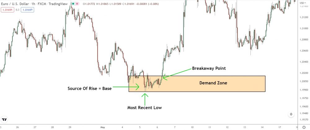
From the most recent MAJOR swing low/high to the breakaway point.
Breakaway point, what the heck is that?
In short: The point where price takes off, and large candles start forming.
Cover the area between the BP and the most recent major swing high or low – the last H/L that sticks out from the surrounding price action.
That’ll cover any points the banks entered buy positions to initated.
Let’s go through some examples…
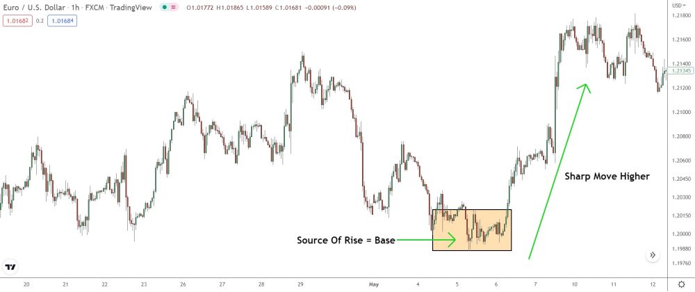
The image shows a large up-movement on Eur/Usd.
It’s clear: a steep rise created this upswing and caused price to jump higher. So, a demand zone must exist at the source (the base).
But which points should you include when drawing the zone?
Well, it’s simple…
First: Find the most recent swing low near the base.
Next: Locate the last SMALL candle before price took off.
Finally: Place the rectangle on the low and drag upto the small candle.
See, told you it wasn’t hard!
The zone covers the entire base, from the most recent major swing low up to the small candlestick that formed at the breakaway point.
If price returns here, watch for long entries.
To draw demand zones, follow the same process in reverse:
First: Find the most recent high near the base.
Next: Locate the last small candle before price took off.
Finally: Place the rectangle on the high and drag to the small candle.
The zone encompasses the high down to the last small candle.
“What about zones with a single candle base?”
Easy – the small candle indicates the breakaway point.
Mark the zone from the candle open, up to the most recent major swing high (for demand zones) or down to the most recent major swing low (for supply zones).
Aside from that, everything else remains the same.
Step 3: Extend The Zone And Make Adjustments
The final step: extend the zone and make any minor adjustments to cover the correct area.
To extend the zone…
Click the right hand side and extend out.
And there you have it!
The zone just sits horizontally, right next to the current price action. You’ll be able to spot when price jumps in and if any entry signals show up.
Easy, right?
Key Point: Some zones may require minor adjustments…
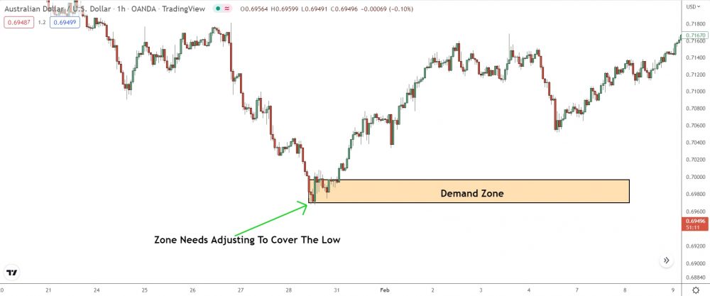
Many traders draw miss the low or high by a few pips.
Or the zone will sit on the wrong small candle at the breakaway point.
These may seem like minor errors, but they can negatively affect trade entry, not to mention overall profitability.
Mark the wrong small candle, price may miss the zone.
Miss a few pips from the low/high; the stop may get messed up.
Don’t sweat it if this happens, just make sure you’re drawing and tweaking those zones the right way. I goofed up big time when I began, thinking it was no biggie. But after losing and missing a bunch of trades, I got my stuff together and started drawing zones properly.
Your Questions Answered!
Q: Are RBR/DBD Zones Drawn Differently To DBR/RBD Zones?
A: No, draw all zones using the same points.
The only difference between RBR/DBD zones and DBR/RBD zones is location. Drawing and trading both types of zone follows the same rules/guidelines. RBR/DBD zones may sometimes form with a less clear base, but you still draw the zone in the same way.
Q: What Time Frame Should You Use To Draw Supply And Demand Zones.
A: Draw supply and demand zones on whatever timeframe you used to find and enter trading opportunities. Zones form on any and all timeframes, so get out there and find those zones!
The Bottom Line
Getting the hang of drawing supply and demand zones might take some time, but you know what they say—practice makes perfect.
Just keep at it, and don’t be afraid to go back and fix those wonky zones you drew before.
Give ’em a makeover with the tips I shared, and you’ll be a pro in no time!

Grab Your FREE E-Book:
5 Pro Rules For Trading Supply And Demand
- Master the core principles of supply & demand.
- Advanced techniques for trading SD zones.
- Exclusive new lessons/books/tools every week!
Sign Up Now To Download Your FREE Guide:
🛡️ Spam-Free Promise: No spam, ever. We'll only send you relevant updates and content. Unsubscribe at any time.
Hi there, I have 2 questions:
1) when the base consists of multiple small / medium sized candles – which candle should be taken as the small base candle from which we draw to the swing high / low? The last one before the price breakout? the second last one? The smallest one in the consolidation area? The resolution of pictures above is pretty low so it’s not that clear.
2) Let’s say I’m trading of 5-15 min timeframe chart. I have found that in this case the zone should be drawn using 1D candles chart. But how many days should I take into consideration? Only the last day or two? Or a week?
What should the settings on the chart be to draw the supply and demand zones?